Kokoon Relax Headphones App Onboarding
Company
General Assembly Student Project
Type
Onboarding Design
Year
2021
Overview
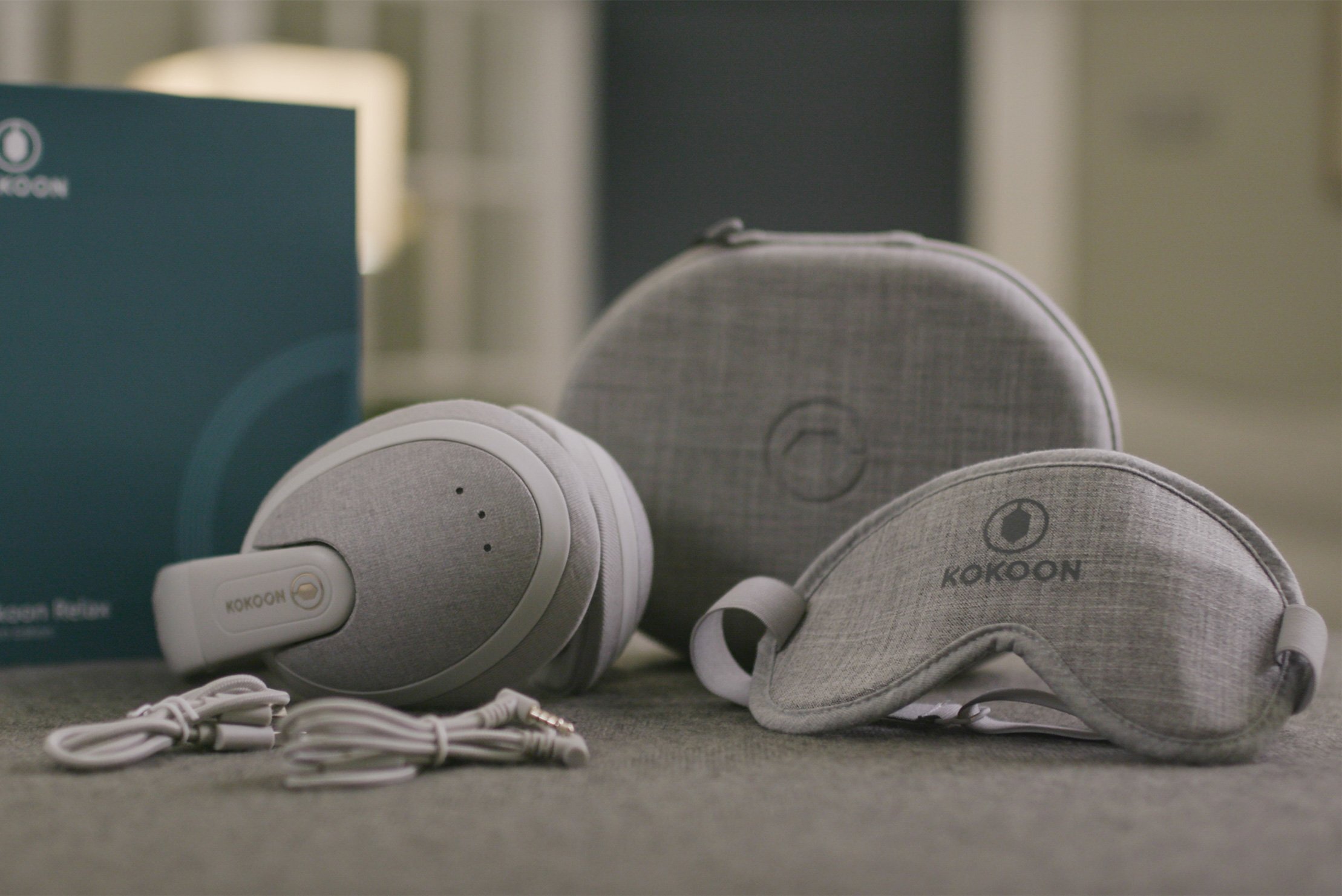
This was a pro-bono project done over 3 weeks for the Kokoon Team in the UK. This project was done as part of the UX Design Immersive program by General Assembly. Kokoon designed a pair of intelligent headphones that can detect when you fall asleep and play white noise to reduce disturbances. It also collects data and gives you recommendations via the Kokoon App. Our task was to create the app’s onboarding process to help users learn how to set up their headphones to be used with the app. Kokoon wanted a seamless experience from unboxing to using the Kokoon App.

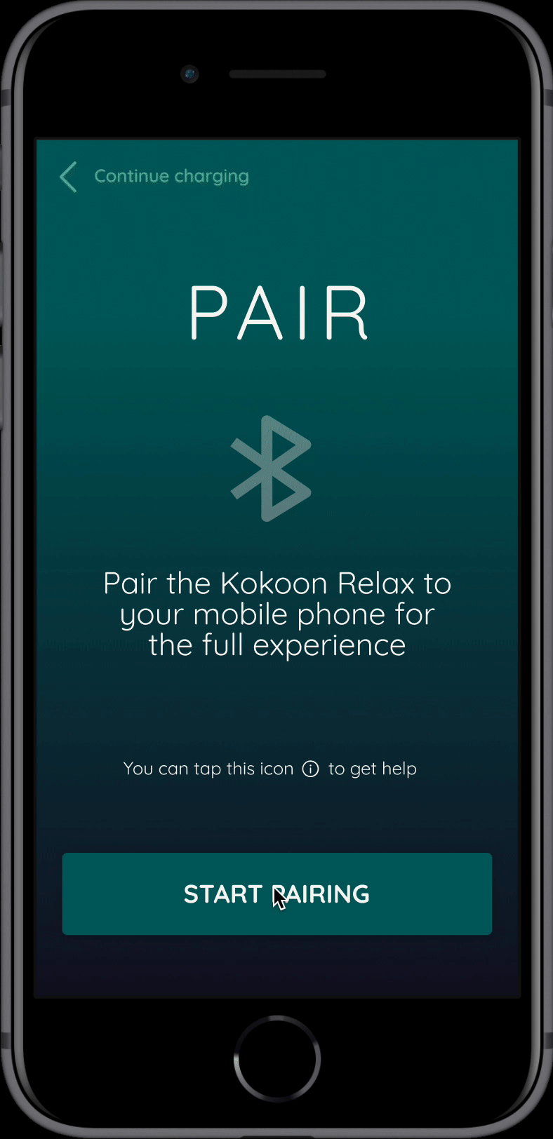
In an effort to reduce confusion and create an error-free pairing process, we reimagined an expanded onboarding flow with 3 phases: CHARGE, PAIR & WEAR. This new design was a culmination of 3 rounds of iterations and deep research.
Problem
The current onboarding wasn’t thorough enough for users who needed more guidance to set up their headphones. Furthermore there was an opportunity in the onboarding flow to delight the users as they begin using their new headphones.

We needed to understand the main frustrations users faced when it came to setting up their headphones. Through information from the Kokoon team, conversations with users and research, it became clear that the app’s current onboarding could do more to ease the transition from hardware to software.
Unexplained bluetooth pairing issues
Some users expressed that they just couldn’t pair their device - “It just wouldn’t work”. Users felt like they needed a way to troubleshoot their issues and get help through the app.
The setting up process is daunting
One type of user is intimidated by technology and is already anxious due to sleep issues. The current app and instructions are presented without much reassurance and visual guidance which makes users more anxious - they just want to start using the headphones.
The app needs to convert non-customers
Some users are in the app to gauge if the headphones are worth the money because of the high price point. As such, the app needs to cater to users who just want a feel of the features available.
User Research & Personas
After a round of user interviews and affinity mapping, our team found that the persona's we discovered validated the personas that were created by the Kokoon team in the UK. This was reassuring and moving forward, we enhanced the personas with more technology-related behaviours.

Charlie is ambitious and values productivity and his career. However, he recognises that his health can improve his life and wants a way to sleep better in a way that works and doesn’t take too much effort. He expects apps and devices to fit seamlessly into his life and likes to see accurate data so that he knows the device is working.
Miriam is looking to reach a more positive mental state. She finds that the apps she use are too generic and don’t directly address her issues. She also needs some hand-holding when it comes to technology and wants to be able to customize the app to work for her.
Past Reference
There was an existing Kokoon App and a Beta App that was shared with us by the Kokoon Team. From these 2 versions, we learned a lot about what works and what can be improved on for the new onboarding flow.


Perfecting the Flow
We started ideating our user flow during a design studio session. This is where we first realized that the user flow is one of the more important aspects of this project because the order in which information appears can affect the user’s experience. The following is the first wireflow we came up with, consisting of Account Creation, Charge, Pair and Wear phases.

There were some key issues that we had to consider after studying this first wireflow:
We need to cater to users who are in the app before purchasing headphones
Some users may have purchased their headphones and may be waiting for them to arrive
When users are exploring the app while waiting for their headphones to charge, we need a better way to bring them back into the onboarding flow
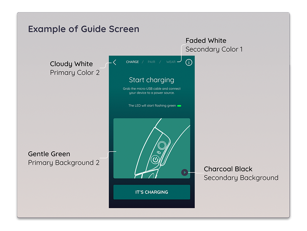
Visually-Driven Instructions
One of the main features of the onboarding flow is the animated visual guides to illustrate the instructions with a high level of clarity. However, we had to iterate the animations from looping to adding a play button for users to choose when to play the animations. This is because some users felt that its hard to know when the animation begins and ends.
V1: Looping Animation
V2: Animation plays once with play button to start over
We made a few versions of the “wear” phase because users had a lot of hesitation and errors during this phase. We needed to understand the order in which the user is making their headphone adjustments and also how they are physically holding the headphones while using the app - this brings their hands away from the phone.

V1: Not all wearing steps could be indicated on the headphones itself. This design also risked the user skipping these steps entirely.
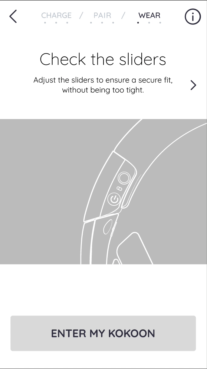
V2: During usability testing, users did not notice the arrows and only did the first adjustment before moving on. Some users also wondered if they were meant to put on the headphones at this stage.

V3: We put the instruction about removing jewellery as the first instruction as it was easier for users to do this before putting on the headphones (of course). We also change copy to say “Put on the headphones”.

V4: We used a more obvious carousel design for users to click through. We also made it toggle automatically so that users don’t have to tap the screen and they want to focus on wearing the headphones.
Troubleshooting & Help
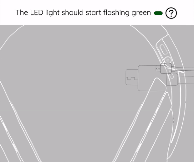
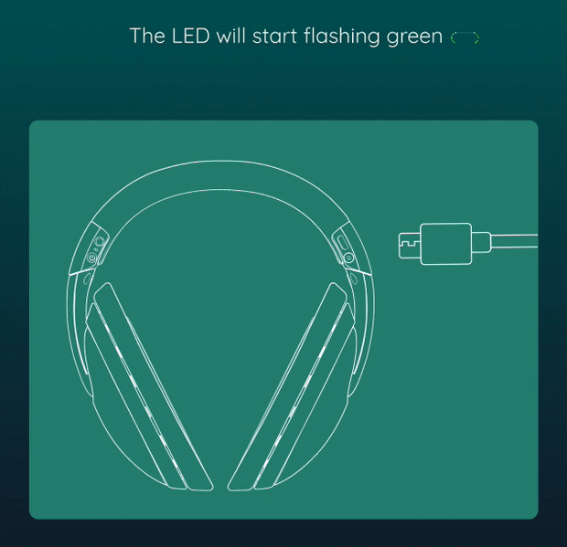
An important aspect of the onboarding system that we spent a lot of time rethinking was the troubleshooting aspect. We wanted users to feel like there was always help available when they needed it and also give them the autonomy to look up information specific to their issues. One main aspect of troubleshooting was to explain the LED lights on the headphones. The Kokoon team mentioned that many users have trouble understanding what the lights mean.

V1: In this version, we designed the info icon to lead to the same web browser support page. The information in the web browser page was a little too broad for onboarding use.
Users felt like the help was too generic and not specific to their needs.
Users also found the LED guide a bit useless at this stage.


V2: In this version, we explored designing individual help screens for each screen to make it more specific. We also moved the LED light explanations into these individual cards so that users will just need to tap on one info icon for all information.
Users felt worried that they won’t be able to see this information if they wanted it at another stage
Users wanted a way to see information from a previous screen if needed

V3: The final version is an in-app troubleshooting page organised into categories. The category relevant to the screen that the user came from is expanded by default. This creates a semi-specific troubleshooting solution where users still have the option to see help info regarding other topics. This is also a great solution for a general in-app troubleshooting page in the main app after the onboarding is done.
Exploring the app without headphones
While we were designing for users who were looking to purchase headphones or were waiting for their headphones, we had to think about what extent of exploration we could allow for a user before pairing their headphones. After discussion with the Kokoon team and aligning with their business goals, we came up with 2 types of exploration: an app exploration without data and an explore page with links to various information pages, videos as well as a demo app.

Design System
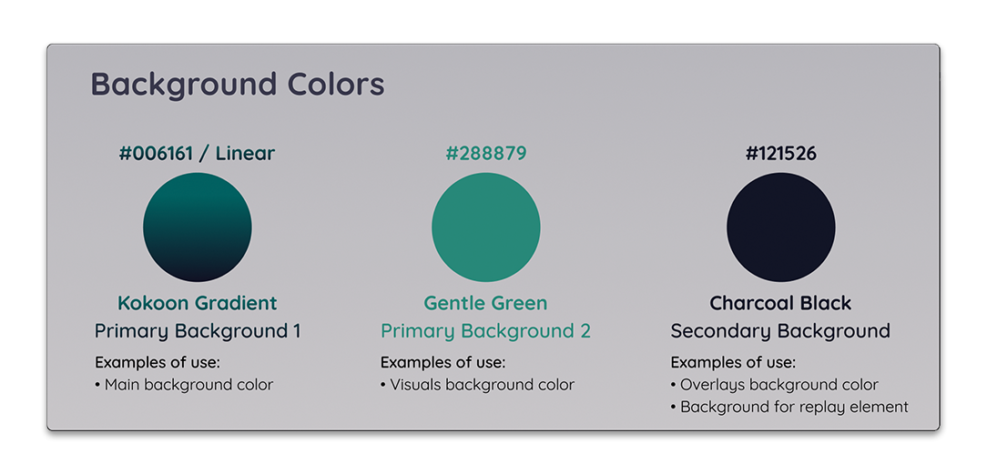
Before deciding on a colour scheme, we experimented with both light and dark colour schemes. As most users use this app at night, we kept the theme dark so it wouldn’t be too hard on the eyes. We also went with the colour scheme that would be easiest to incorporate with the current colour scheme.

Initial colour options


Outcomes
The project was a successful one and our clients from the UK were pleased with the results! Aside from the praises from the clients, internally as a team we felt accomplished and satisfied with the way we worked as a team and the quality of the deliverables we produced. We enjoyed being able to design an app around a physical product and think of the user experience from off-screen to on-screen. It was a lot a fun. Here are some things I learned along the way:
Research guides design, it is not always the end-all for decision making
As this was our first client project, we realised that design decisions don’t always come directly from research. We also needed to constantly talk to our clients and discuss our ideas and research to see if it met business and operational needs.
Furthermore, some of the design decisions that came from research resulted in a lowered SUS score in our second usability test. When this happened, we were forced to think what could have gone wrong? The simple answer being, we didn’t realise that the design solution we came up with was not suitable for a certain persona and most of our users during usability testing were more inclined towards that particular persona.
Onboarding is a short flow but requires a lot of research and testing
Although I first thought an onboarding sequence wouldn’t be too challenging to design, I quickly realised the challenge was in making it as informative and educational as possible but in a short and succinct way. It had to hold the user’s attention and keep them excited while holding all the information they needed to set up their headphones and use the product well. This required strategising and a lot of iterations. We would need to keep testing and iterating to get the optimal onboarding flow.