Registry of Marriages Website Redesign
Company
General Assembly Student Project
Type
Website Redesign
Year
2020
Overview
Most Singaporean couples going through the marriage process will have to access the ROM site to register their marriage. Despite the importance of the site in the marriage process, the ROM site lacks empathy for its users and although it serves its functions, it leaves users feeling drained rather than excited about their upcoming marriage.
Context
The ROM website is where Singaporean couples have to file their notice of marriage prior to registering their marriage. They are also required to look through the pre-approved list of solemnisers and make an appointment to verify their documents at the registry of marriages office. Looking at the website as a team, we wanted to create a website that made users excited about starting their marriage process instead of adding on a layer of stress onto their wedding planning.
Understanding the problem
The current ROM website contains a heavy amount of information organised in an FAQ style. Although the amount of information is a great start, it is difficult to find specific information. After digging deeper into the ROM process, we realised that there is a strict timeline and order of activities to follow. For example, in order to file your notice of marriage, you need to know your solemniser’s details. The order of activities was not common knowledge for the users.
FAQ-Style information require users to read through lengthy pages
Form to File Notice of Marriage doesn’t pre-empt users about what they need beforehand
Our research encompassed:
- Finding out more about Singaporeans’ attitudes towards the ROM process
- Understanding the ROM process from the user’s perspective
- Doing some benchmarking to see how the site can improve
The Solution

Visualizing the ROM Process
We introduced a timeline flow
This feature was created for the couples who wanted an overview of the whole process to better prepare themselves for their registration. Instead of collecting bits and pieces of information from all over the site, they would be able to see all the different stages of registration and access the relevant pages from this overview page.


Revamp the Information Architecture
Major changes to navigation
The current website’s navigation has information in ambiguously named categories. It is unclear how “About ROM” and “Marriage Info” differ in terms of content. Furthermore, users tend to have differing opinions on what '“ROM” and “Marriage” entail - this is another source of confusion.
We decided that users needed a navigation that reflects the timeline of registering your marriage from start to end. Due to the nature of the ROM process, we found out that this is the best way to present all the information available in a way that users understand.


Present Information Neatly
Using cards to store information
After making the navigation more intuitive, the next step was to organize information within the pages. We used cards to shelve information in a logical way and made sure there wasn’t too much text upfront so users can pick what they want to learn more about.

User Research
The pandemic shifted users’ attitudes towards the marriage process.
The pandemic caused new restrictions on weddings and couples who live in different countries. Some users were less excited about their wedding planning after having to scale it down due to restrictions. However, some users were now even more excited to be able to get married after reuniting with their partner during this uncertain time.
Personas

Process-Driven Patrick
Patrick wants to simplify his life because he has a lot of things going on. He wants to get through his life’s milestones one by one in an efficient manner.

Patrick is a practical person who prefers seeing the big picture over fretting the trivial issues. He is single-minded and process-driven. Even when it involves matters of the heart, Patrick sees the rational side of things. Marriage, to him, is mere legality, and that one shouldn’t spend more time than the required minimum on the process.

Researcher Rachel
Rachel wants control in every aspect of her life and be able to make well-informed decisions.

Rachel’s boyfriend recently proposed to her on their Paris vacation and they have begun planning for the big day next year. Besides ironing out the fine details of her wedding banquet, she is also fussing over the solemnisation process as she wants it to be picture perfect! Rachel wants to know as much information as possible so she can plan everything to a T!
Although Patrick and Rachel had different goals and motivations, their struggles can be summarized as follows:
✘ They are unable to find the information needed easily
✘ They don’t understand the process and information
✘ They don’t feel prepared to complete the process without making mistakes
We needed to design userflow that would allow users to do prior research if needed (Researcher Rachel) but also allow users to go straight into the process without prior reading (Process-Driven Patrick) if they wanted to do that. The below user flow illustrates how the research part of the user flow is typically only carried out by the Rachels and subsequently, the Patricks can enter the flow during the filing process.

Benchmarking
Competitive Analysis with New Zealand’s ROM
Scrollable timeline tells you what you need to do register your marriage from start to finish
Users can access the necessary information according to what stage they are in
Comparative Analysis with ICA
Call to action buttons that help to guide users according to their current status
Feels personalised and quickly relatable to speed up the process
Comparative Analysis with Ministry of Manpower
Information is organized into bite sized sections
Card style helps to break up text and make the large amount of information seem less overwhelming
Iterations

Keep some accordions open by default
We learned that users need to be guided on what information is more important than others and that sometimes, information can’t be shelved when it is crucial for the user to read it. As such, we had to keep some accordions open as default so that users read it and tick the confirmation button below.

CTA buttons in relevant sections
We also realized, some information although helpful as text, would be more helpful if we added a CTA button so the user can move forward from that point. These are just shortcuts to help guide the user to move along in their journey.

Designing a form
The form section of the filing process is a big part of the process because thats where the user has to “do” the most. We didn’t focus on this part of the process much because most people had bigger issues with finding out information - the form was straightforward. However, as a team, we felt that the form could be improved a lot more to help the user feel less overwhelmed by the huge amount of information they needed to key in. The one edit we made was to group similar types of information together and remove duplicate questions. We also linked singpass information so some details are autofilled.

Payment Confirmation
Users expected the payment confirmation to look different and more “official”. We decided to design a page that looks lighter and also add an icon at the top to indicate confirmation.
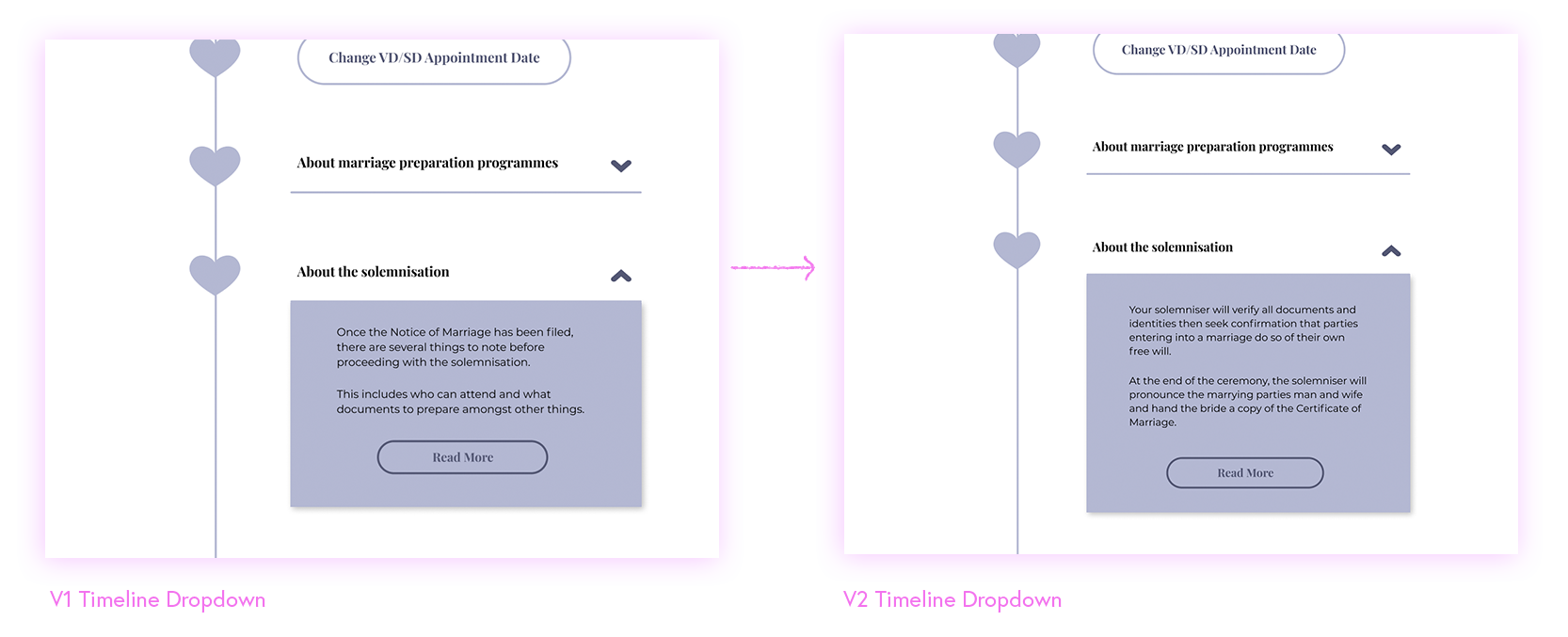
Timeline Dropdowns
Initially, we designed the dropdown to hold information that describes what users can find in the linked page. But we realized users would rather see a summary of the information and read more if thats what they are interested in. As such, we changed the nature of the text in the dropdowns to be more informative and less descriptive.
Style Guide
We wanted the website to reflect the love and purity of a marriage. As such, we used pastel colours and kept the main pink colour that the current site uses. We also went for a more romantic font choice with Playfair Display.

Outcomes
This project was a great collaboration with my team members as we all managed to use our different strengths to perfect the solution. Given the 2 week timeframe, I’m proud of my team to have been able to come up with a solution for the ROM site based on solid research. Every project brings new learnings for me. Here are some things I take away from this project:
Focus on the MVP
The redesign of the ROM site is a fairly big project given the timeline of 2 weeks. As such, during the initial research phase, we had to quickly decide what issues we were going to solve. There are many ways a website can be improved but we wanted to focus on the ones that will make the biggest impact on the user experience. We used what our users said during user interviews to narrow our scope. I learned that it is important to rank the site issues by importance and impact - and stick to our narrowed scope.
Sketching Ideas
I remembered the importance of sketching and design studio during this project because we had a rich array of ideas from our sketching session. It is also important to be exposed to sources of inspiration prior to sketching so that the studio session can be more fruitful. Ideas like the timeline were first visualized during sketching because we had all seen benchmarking examples before hand.