Sewing Machine E-Commerce Redesign
Company
General Assembly Student Project
Type
Overall Site Redesign
Year
2020
Overview
The Ban Soon Sewing Machine store has a wide range of sewing machines from basic sewing machines to industrial machines and staff with rich knowledge about these machines. However, their website lacked organisation and guidance, leaving customers lost without knowing where to begin. How could I improve the way that the machines were categorised and help users find the machine they need quickly?
Context
I had recently just bought a sewing machines at Ban Soon Sewing Machines & I loved their warm service and dedication. They have served the Singapore sewing market for over 40 years since their establishment in 1976. This project asked for a well designed e-commerce site catered specifically to accommodate sewing machine buying habits.
Understanding the problem
The current Ban Soon Sewing Machine site has a very wide range of products, from industrial machines to specialty embroidery machines to basic sewing machines. However, the products did not have the best organisation and site navigation was messy. Many parts of the website seemed overwhelming for a beginner because of the sheer number of filters and options available.
My research encompassed:
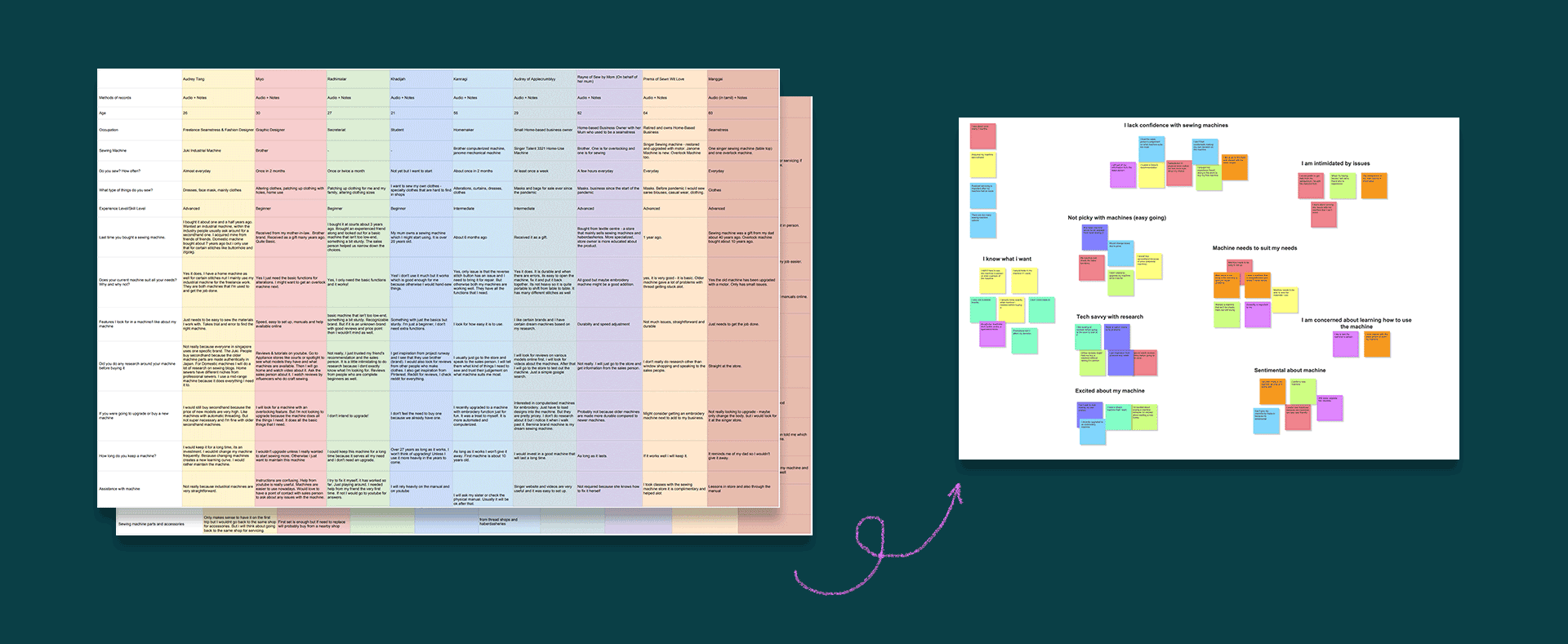
Understanding specific user goals and needs
Doing some benchmarking to see how the site can improve
Understanding how users categorise sewing machines
The Solution
Simplify the Search Process
Find your perfect machine
This feature was created for the beginner sewists who needed guidance regarding their machine choice. Instead of expecting beginners to use a large array of filters in the product listing page, I broke down the process into step-by-step questions. The questions were also asked in a way that wouldn’t intimidate first-time buyers - for example, “What types of projects will you be sewing?” & “What types of fabrics will you be sewing?”
Clearer navigation
This feature was created to de-clutter the main machine navigation dropdown. By creating 3 sub-categories, users can focus on the category that they prefer and only see those options.
Humanise the digital process
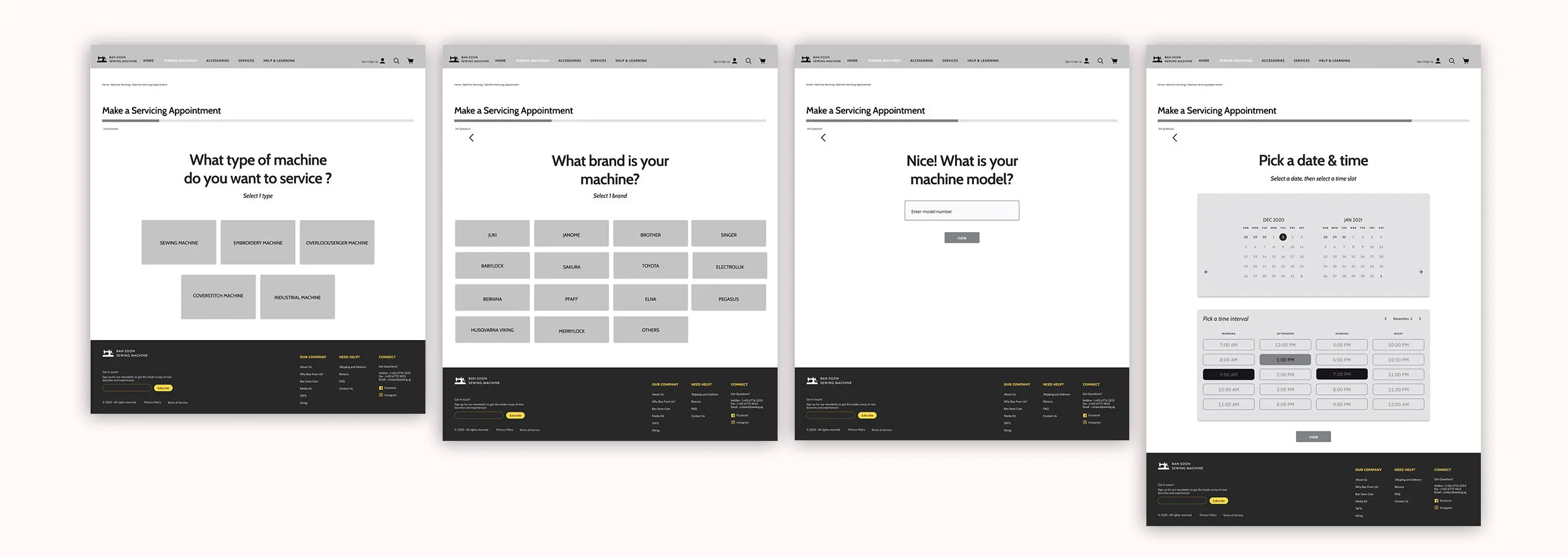
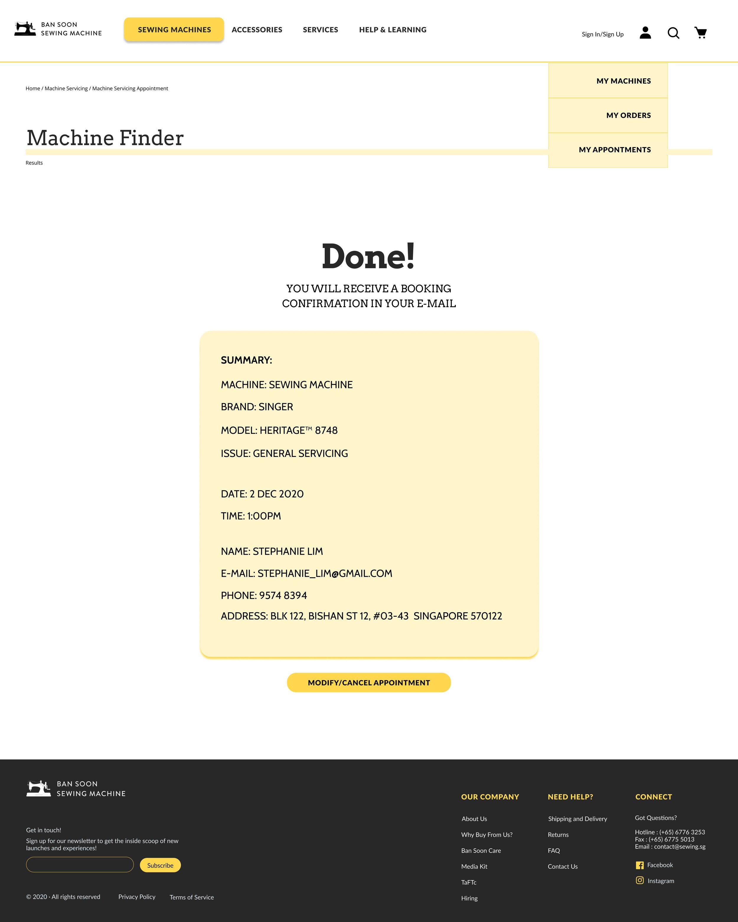
Make a servicing appointment
Servicing a machine can be quite a daunting task because the user is already frustrated that their machine is having issues. I wanted to make this process as encouraging and helpful as possible while keeping the tone of voice light and optimistic.
Closing all the drawers
Accordion-style organisation
I wanted to store information neatly and remove unnecessary clutter in the product detail page and also in the filters on the product listing page. This gives the user more room to breathe and they can access only the information they care about.
Scroll to view my process
otherwise, here are some quicklinks:
User Research | Personas | Benchmarking | Prototype | User Testing
My process is based on the Double Diamond Theory incorporating the key phases of Research, Synthesis, Ideation and Implementation.
User Research
The pandemic created more home-based mask sewing businesses and beginner sewists hoping to pick up a new hobby.
It was interesting to study the change in habits surrounding the use of sewing machines after the pandemic. By reaching out to beginner sewists and home-based business owners, I was able to capture new behaviours as a result of the global pandemic. As such, Ban Soon’s website can be more prepared for what users need during this unique time.
Personas
Bright-Eyed Becky
The first persona I identified is someone who is new to sewing and typically is just looking for a basic machine. They don’t want anything fancy and also rely heavily on the product specialists in store to guide them when picking a machine. During interviews, many users expressed excitement to start using the machine and creating things - they were not too interested in the buying process.
creative | bubbly | crafty | easy-going
Sentimental Susan
This second persona represents users who are advanced, seasoned sewists and they typically use a machine that they’ve owned for a long time. They are not too interested in upgrading but more concerned with maintaining and modifying their existing machine.
very busy | passionate | caring | people person
Problem Statement
Users need a way to feel sure about their machine choice & easily get support to maintain their machine so that they can focus on the joy of sewing.
Solution Statement
A website that closely guides users to find a sewing machine for their personal needs and helps users make an appointment to get help for their machine in a friendly way.
Benchmarking
Competitive Analysis with Singer
Clear navigation showing only Machine Types as a categorisation type
Relatively shorter list of options on the dropdown menu
Perhaps Machine Care could be a top level category on its own?
Comparative Analysis with AppleCare
Intuitive questionnaire that makes you feel at east from the beginning
Each question is shown one by one to create a more stress-free experience
Questions are asked in a casual, friendly & helpful tone
Comparative Analysis with Crate & Barrel
Many filter options are easier to process when they are stored in accordions
All accordions are closed to give user full control to choose the information they need
View the lo-fi prototype
User Testing
3/5 users
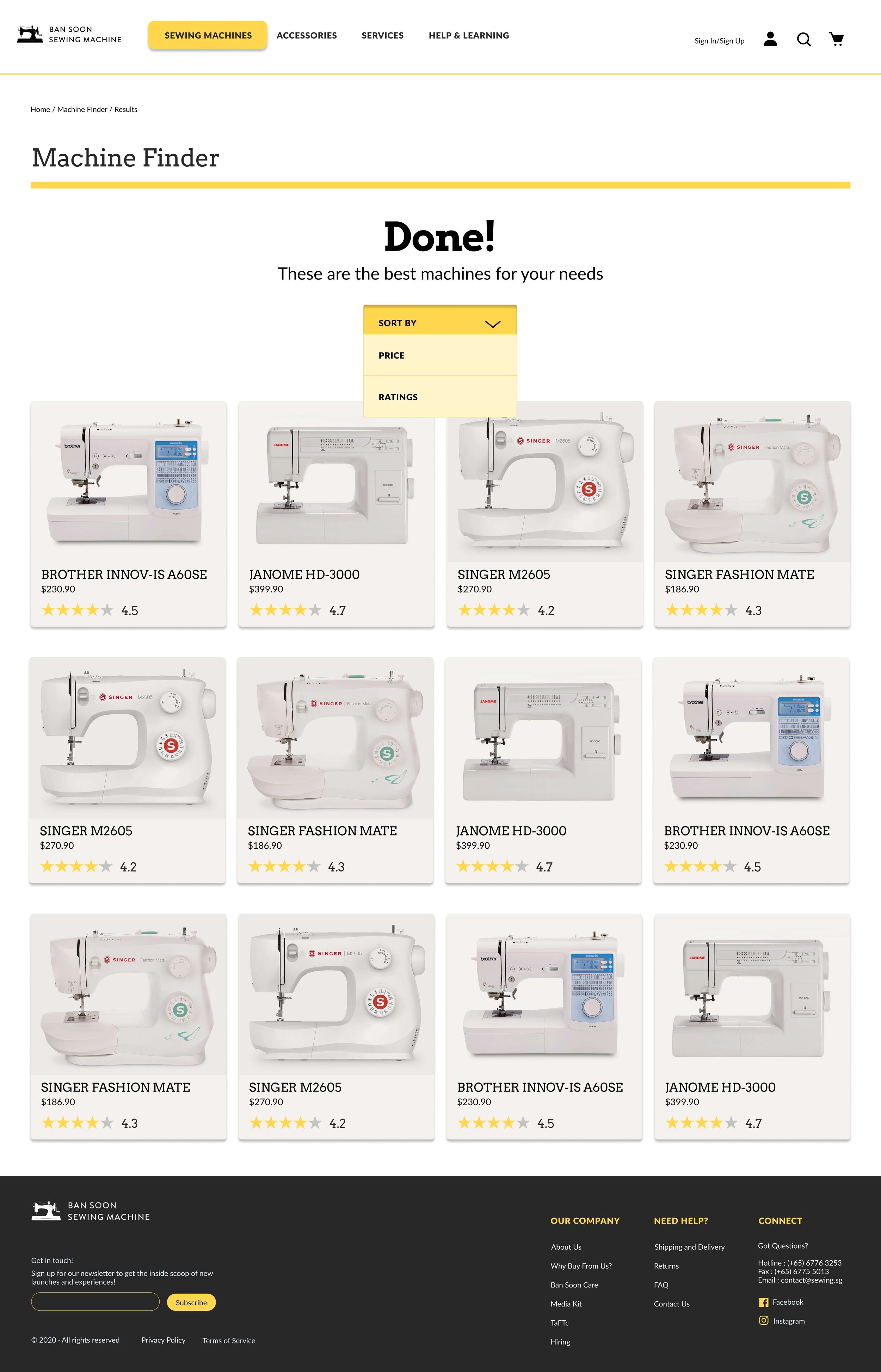
expected the quiz results page to expand on the same page
Analysis
Users expected a completely personalised journey after taking the effort to answer the quiz questions.
Iteration
Create an expandable view of listings on the results page and add simple sort function for price.
2/5 users
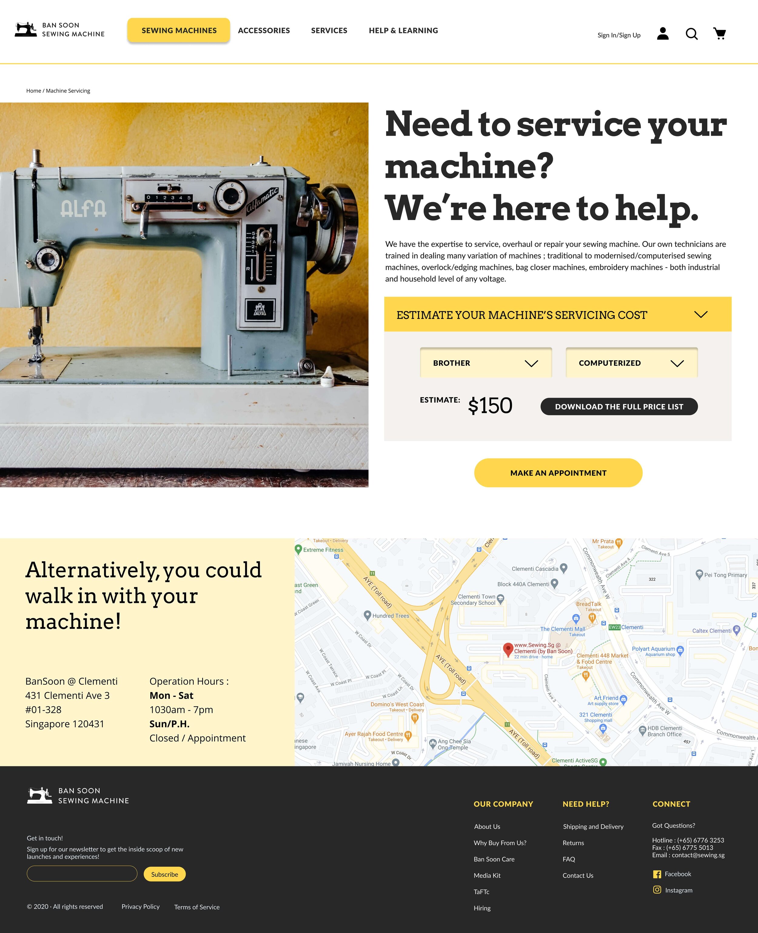
raised questions about the price list - not sure what to expect before downloading it
Analysis
Users are hesitant to download an item without knowing what exactly to expect but still want to know the prices.
Iteration
Create a drop down box to view the price list before prompting them to download it.
2/5 users
raised concerns about modifying and canceling the appointment
Analysis
Users are not sure how to access the booking confirmation page after making the booking to edit their booking.
Iteration
Add option to change or modify an appointment by booking number under “My Appointment”.
Include a “Modify/Cancel Appointment” button under the confirmation
Final Mock-Up
For the colour scheme, I chose to continue the yellow, black and white theme that the existing website uses and build on the design through friendlier rounder shapes and create clearer hierarchy with slab serif headers. Overall, I feel that the website looks more approachable and inviting.
Outcomes
This was a really fun project for me to work on as i feel it has potential to provide real value to the business, involved a ton of detailed research, and high-fidelity deliverables. However, thats not to say it was an easy journey. I learned a lot in regards to doing quality research and was able to see what I needed to improve on as a UX designer.
Always remember to toss your assumptions
New social landscapes that resulted due to the pandemic changed behaviours towards sewing machines. This reminded me that many factors can affect user behaviours and is just one more reason to remember to keep my assumptions in check and go into user interviews with an open mind.
Persevering for good UX
I had to work under a short timeline for this project which made it difficult to find quality users to interview. Instead of sticking to my social circle (most of whom were beginner home sewists) I pushed myself to mass message professional seamstresses and sewing business owners. Although this was daunting for an introvert, I’m so glad I did it because it allowed for richer insights and a better quality site!
Testing, Testing, Testing
I had done my user test using my grayscale wireframes which was a great way to get feedback on the general flow. However, after iterating the feedback into a hi-fi mockup with colours and images, I found that new issues surfaced and another round of user testing would have been nice to iron out these issues. I learned that testing will probably never end when it comes to developing a quality product.


