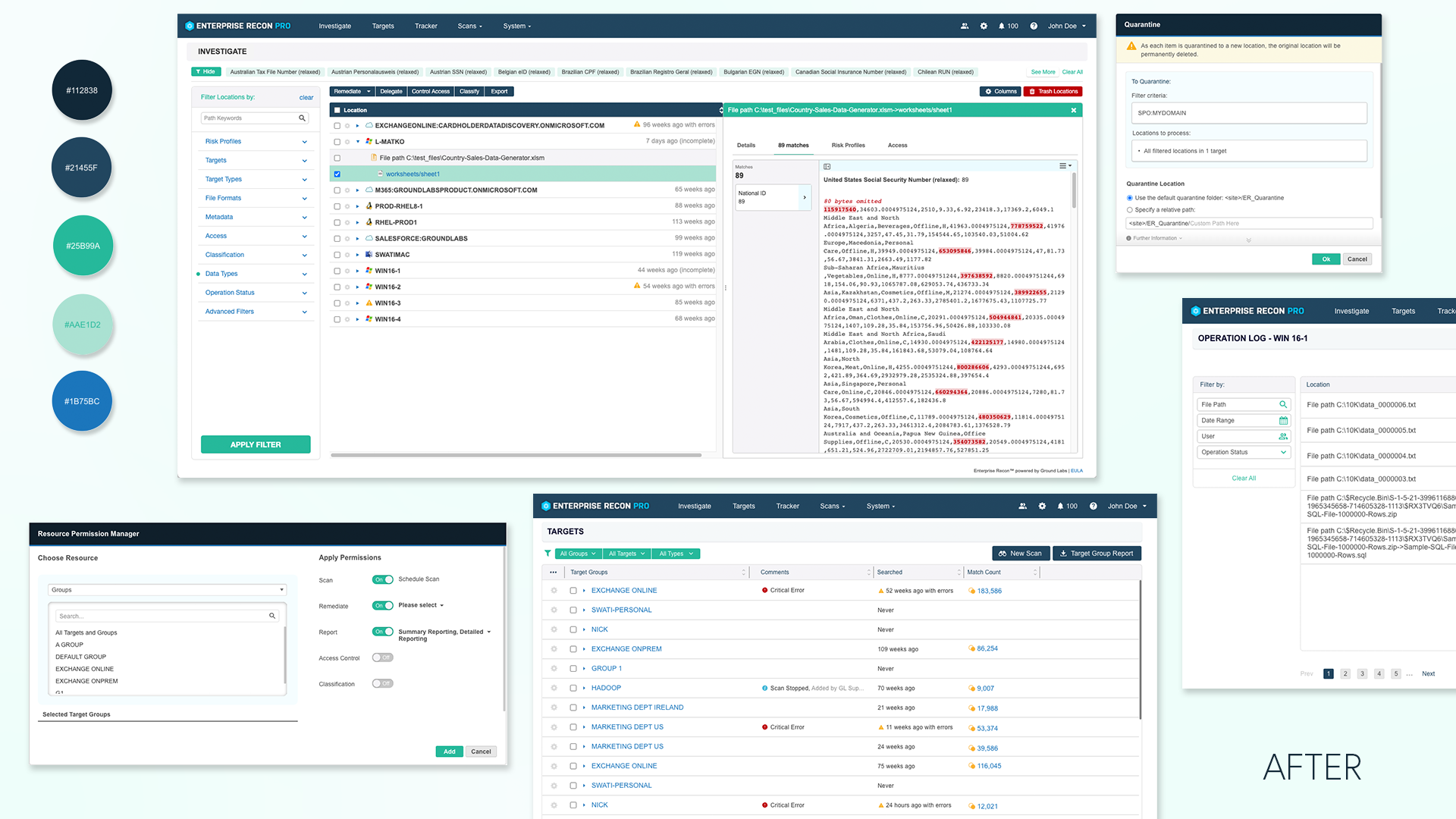
Kicking Off a Design Sytem
Company
Ground labs
Type
Design System
Year
2024
Context
Initiatives Undertaken:
Navigating the complexity of an outdated and inconsistent design system during a brand rebranding phase posed a unique challenge. With a UI in transition and a lack of solid documentation for development processes, our mission was clear: transform the chaos into clarity.
Component Audit
The first step in my journey was a thorough audit of existing UI components. This meticulous process was akin to conducting a detailed inventory—identifying what needed revision, what should be retired, and what could be enhanced to align with our new brand vision.
Comprehensive Styling and System Update
My approach to the styling update went far beyond cosmetic changes. It was about creating a unified language across all UI components that encompassed consistent functionality, standardized iconography, and clear, uniform copywriting. This strategic overhaul was designed to ensure that users could intuitively understand and navigate the interface through familiar components, thereby enhancing the learning curve and user experience. Each element was carefully revised to promote ease of use, helping users to interact with the platform more efficiently and confidently.
Efficiency through Clear Documentation
To enhance development efficiency, I meticulously documented every aspect of the design system. This included detailed specifications and guidelines for each component, serving as a comprehensive manual for our developers. These documents provided clear instructions on implementation, significantly simplifying the development process and reducing time spent on back-and-forth clarifications.
Strategic Prioritization
Recognizing the importance of impact, we prioritized the update of components based on their usage frequency and visibility to our customers. In other words, we only built the “Quick Wins”. This targeted approach ensured that our efforts would yield the most significant benefits in user experience enhancements.
Key Upgrades and Tweaks
Enhanced Dialog Box Functionality
In my redesign of the dialog boxes, I focused on solving a critical usability issue where users were unable to close dialog boxes that extended beyond the screen due to lengthy error messages. This was more than a nuisance; it effectively blocked users from continuing their work, as they couldn't interact with the software until the dialog was closed. To resolve this, I implemented Scrollability, ensuring that all content, no matter how extensive, could be easily accessed without altering the box size. While scrolling, the close button is always accessible.
As I did an audit of our key dialog boxes, I also looked into how the forms and the copywriting can be improved and made more consistent. Some text should have been put into warning banners, and some warning banners could have just been better form input field instructions.
Color Palette Rationalization
I reduced our color palette from 130 disparate shades to a more cohesive set of 33. This not only improved the visual harmony of our platform but also facilitated easier maintenance for the devs and future scalability.
Comprehensive Component Usage Guidelines
To streamline design and development processes, I established detailed guidelines for commonly used components like buttons. These guidelines are meticulously designed to ensure consistency across our platform, enabling future designers to seamlessly integrate these components into their projects. Moreover, developers can make swift design decisions when implementing minor features, thanks to the clarity these guidelines provide. This initiative not only enhances the aesthetic uniformity of our products but also significantly reduces the time and effort required for onboarding new team members and executing new features.
Future-Proof Design
Anticipating future needs, all components were designed with adaptability in mind. Whether it’s a brand update or a functional pivot, our design system is equipped to handle changes efficiently, minimizing future overhaul efforts.
Key Takeaways
Commitment to Continuous Improvement
Regular updates and refinements to the design system are crucial. They keep the system relevant and widely adopted, preventing it from becoming obsolete or bloated.
Effective Prioritization
Leading the project taught me the critical importance of prioritizing tasks that deliver the most value. This approach not only maximizes resources but also aligns closely with strategic business outcomes.
Importance of a Unified Development Library
One of the largest obstacles to maintaining a consistent and cohesive product was our lack of a unified development library, such as Material UI or frameworks like Angular or React. Without these tools, each designer at the company created their own versions of components, leading to a chaotic array of styles and functionalities that severely fragmented the user experience.
This decentralized approach meant that updating the design of one component did not automatically revise others, as they were not interconnected through a single system or library. The absence of a unified library led to significant inconsistencies across the platform, complicating the development process and diluting the brand's visual identity.


