ER Reporting Tool Concept
Company
Ground labs
Type
Concept & Initial Research
Year
2023-2024
Objectives
My Role
The primary goal of this project was to redesign and reimagine the Enterprise Recon dashboard and reporting capabilities to increase its usability and effectiveness for diverse user groups. Specific objectives included:
Enhancing User Engagement: Redesign the dashboard to make it more intuitive and engaging, encouraging regular use rather than reliance on external tools like Excel.
Improved Data Visualization: Integrate advanced data visualization tools that can dynamically adapt to display the most pertinent data, helping users make informed decisions quickly.
I owned this conceptual early-stage project and presented my findings and early ideas with the leadership team at the end of the process.
Project Overview
Enterprise Recon by Ground Labs is a flagship product designed to help organizations discover, track, and manage sensitive data across their networks and devices. As a comprehensive data discovery solution, it plays a crucial role in ensuring compliance with global data protection regulations and safeguarding against data breaches. Despite its advanced capabilities, feedback from users indicated that the dashboard, a key component for data management and insight gathering, was underutilized. Users frequently resorted to exporting data to Excel for more tailored analysis and visualization, highlighting a gap between the dashboard’s functionality and the user's needs.

The Key Issues
During the initial phase of the project, significant feedback was gathered from users, highlighting key areas where the dashboard and reporting functionalities of Enterprise Recon were falling short. These insights were crucial in identifying the specific issues that needed to be addressed in the redesign.


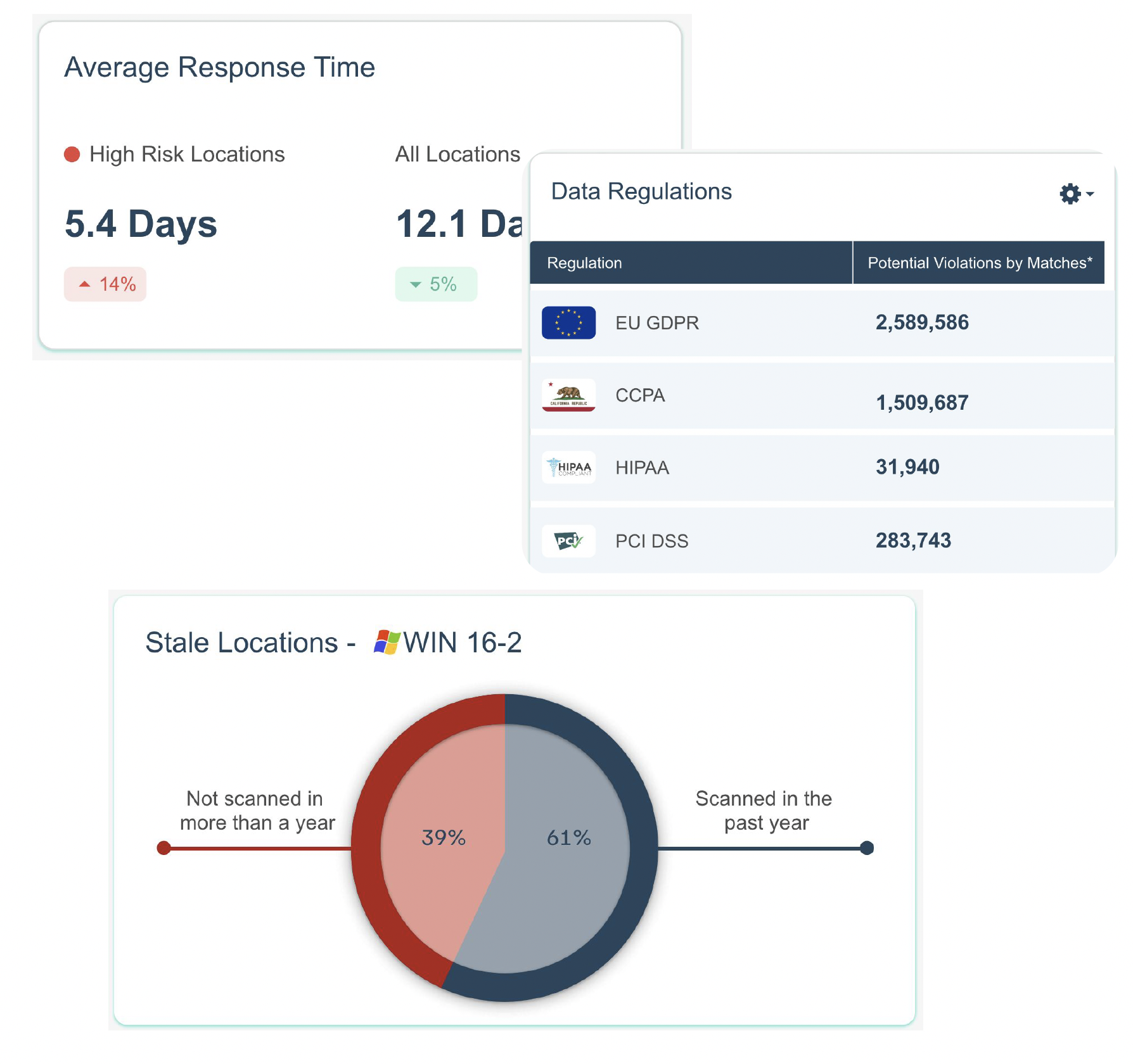
Current Dashboard
Clarity of Data Presentation: Users reported difficulties with reading the data presented, particularly with line graphs that were not clear or intuitive. This made it challenging to quickly grasp key trends and metrics.
Relevance of Displayed Data: The dashboard primarily provided a generalized overview of all machines monitored by the software. However, teams often needed to focus on data from specific departments or groups of machines, rendering the default data presentation irrelevant for their purposes.
Accessibility of Important Data: Critical data points that users frequently needed were not immediately visible upon accessing the dashboard. Users had to scroll down or navigate through multiple sections, which hindered quick access and reduced the dashboard’s practical usability.
Current Reports
Dependency on External Tools: A common practice among users was to export data into Excel. This was primarily because the current reporting tools did not offer the flexibility needed to manipulate and analyze the data as required.
Inefficiency in Filters: The system did not allow for the saving of customized filters used during the export of specific reports. Users had to manually re-enter these filters each time they generated a report, leading to a repetitive and time-consuming process.
Data Gathering
Before delving into the design phase, it was essential to ensure that the dashboard and reporting features would be grounded in real user needs and the capabilities of our current systems.
I collaborated with the API specialist to understand the technical feasibility and limitations of accessing and manipulating various data points. We compiled a detailed list of all data accessible through our APIs, which formed the backbone of the dashboard’s data architecture.
I spoke to support and product teams to align the data presentation with user expectations. This multi-disciplinary team effort was aimed at determining the most valuable manipulations and presentations of the data. For each data point, we discussed and outlined how it could be processed to deliver maximum value, considering both the common and unique needs of our diverse user base.
Here’s what I learned:
One size fits doesn’t fit all
Different users need different dashboards and data.

One way to solve this is to have multiple dashboard views, tailored to each persona.


However, each persona often has specific requests for data at different points of the year based on their priorities.

How can we empower users of various roles to discover insights hidden in their data and make better decisions daily?

Creation and Customisation Tools:
The Proposal:
A centralised interface to create and customize dashboards and reports
This proposal is based on extensive competitive analysis, as well as user interviews and prior user feedback that has been collected.
Each user persona will be able to customise and curate a set of dashboards relevant to them to be viewed on the homepage of the reporting tool
Before we start building this tool, the backbone of this project will be the data intelligence. The UX team, along with a technical data specialist will need to find out:
What questions are our users asking?
How can our data provide actionable insights?
What are the KPIs our users are interested in?
1. Large Template Library

The tool should provide a variety of templates for all types of user roles and to suit the different needs they may have throughout the data discovery and remediation process. This is so that users don’t have to start building their data view from scratch and saves them some valuable time. These templates can be used for their homepage dashboard, or to be exported as a report.
2. Personalised Recommendations

Users should be able to indicate which categories of data they are currently interested in, so that the tool can recommend relevant templates. This preference data will be saved in each user profile and can be updated at any time.
3. Drag & drop interface to create/customise dashboards

Upon selecting a template or creating a dashboard/report from scratch, users will be taken to a drag and drop interface to customize the layout of their data view.

Users should also be able to customize the visualization type and data shown in each chart.
4. Customizing Detailed Reports
Sometimes, a more detailed report is necessary, for export as a document. A different workspace can be built specifically for this use case as these reports are sometimes exported weekly and take a lot of time.

Users should be able to apply filters and parameters so that only the data they are concerned with is shown in the report. These filters will be saved in the template and can be reused each time.

Users can then add data formats more suited for detailed reporting needs, such as data table and lists for documentation purposes.
5. Automated Delivery of Reports

Users should be able to schedule the automatic delivery of specific reports to the right stakeholders. Alerts should be abled to be triggered based on specific KPIs too.
The proposed user flow

Next steps based on stakeholder feedback
Could we create benchmarks that users can compare their data against?
During the presentation, we discussed the possibility of having industry specific data points that users could compare their compliance data against, to see how they are doing compared to other organizations.
Speak to customers and validate the data points needed.
I felt that for this specific research scenario, quantity will be important to truly understand the breadth of data that might be important to our customers. I would propose to design a survey to be sent out on a large scale, perhaps with some compensation for their participation, followed by calls with a select few customers to learn more about how their teams interact with the data and dashboards.
Identifying Third-Party Data Visualization Tools for POC Integration
For the proof of concept, the product team decided to utilize an existing third-party system that aligns with our UX requirements. This approach allows us to leverage advanced features without the need for extensive development from scratch.