This case study dissects the redesign of one of the key pages in Enterprise Recon, where users view sensitive data findings and take action on them. It helps users to make better & quicker remediation decisions, potentially saving them millions of dollars in compliance fines.
I pitched and led this redesign project as a proactive UX improvement. I did the research, design and prototyping across 6 months and oversaw the development process up until it was launched.
Users couldn't efficiently use the data table and inspector
We had qualitative feedback from the support team that users could not use the data table and inspector efficiently, due to usability issues that severely slowed down the process. Many users opted to export the results into a pdf or csv report where they analysed the results there instead.
Internally, the engineering and product team had also noticed basic usability issues that caused frustration while browsing the data table and inspector.
Improve the data table design in a way that fosters an efficient and effective understanding of the information
Enable users to scan information and perform actions on them in a shorter time
Companies will be able to secure their data at a faster speed, potentially saving them millions in fines
Interviews and heuristics to document each usability issue
To further inform our analysis, I conducted interviews with members of the support team to understand the exact usability issues on each part of the data analysis workflow. I also conducted a heuristics analysis to document each usability issue and the impact of each one.
Clicking on a location opens a preview window that obstructs the view of the table rows
Overall, I found that it was difficult for users to browse between locations without losing track of what they looked at previously. Users wanted to gain quick insights on each location down the list to make a comparison and prioritise the important findings.
The location preview section has a short height, causing lots of scrolling
Part of gaining quick insights is to be able to view location document previews in text format. Currently, the preview window was wide and short, requiring a lot of scrolling — users wanted to get a gist of the content with one look.
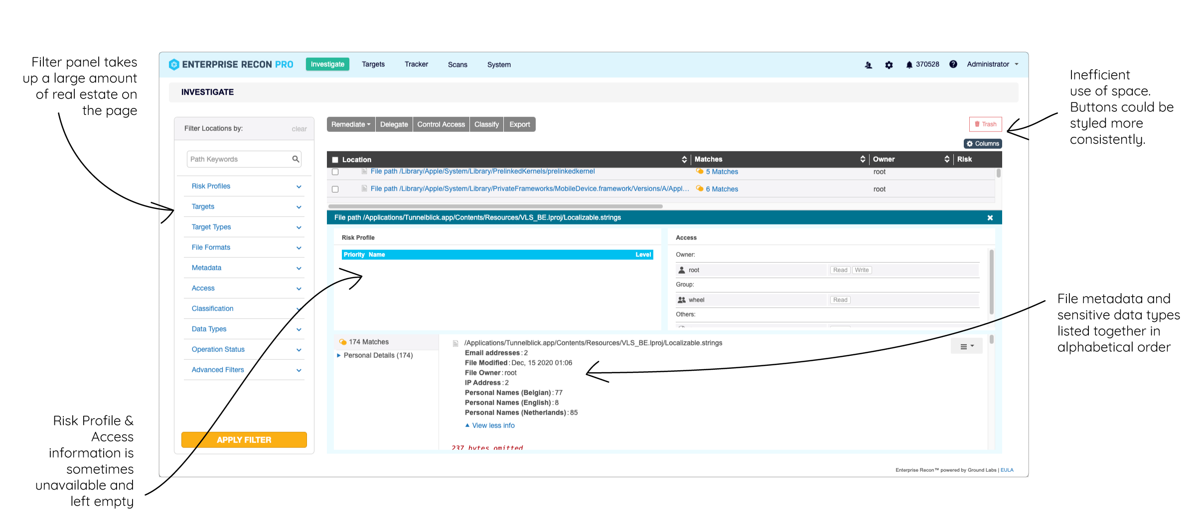
Other issues with the layout and the way information was organized
Some other issues:
- The filter panel took a large amount of space, although we received feedback that the filters are under-utilised.
- There are fixed spaces for Risk Profiles and Access information, although that information is not available on every file. This causes it to be left empty, taking up space that could be better used.
- File metadata and data types found are mixed together in almost a jumble. If a user just wanted to see file metadata, they would need to carefully scan the lines to find just that information.
- The buttons on the top of the data table could be arranged to make better use of space, and to be more consistently styled overall.
Side-Opening Data Preview
After doing some research on opening previews from a data grid, it was clear that having a vertical side-opening window would benefit our users greatly. This is especially because users want to browse through rows while keeping the preview window visible.
While I got inspired by this concept, due to feasibility of implementation, we were only able to open the preview window within the data table, and not over the entire page. We got validation from the support team that this would be ok, as users just need the location column to be visible while browsing.
Opening an item's preview window on Monday.com
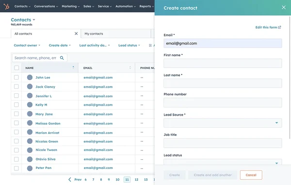
HubSpot's side-opening preview for a contact
Displaying Data Counts
It is best practice to show a total number of items in a data table or log in a way that is helpful to users. The data count is one way for users to make sense of the data they are seeing and is something we take for granted. (Imagine if Gmail didn't display the total number of e-mails in our inboxes — we would be living blissfully ignorant of our overcrowded inboxes!)
In Enterprise Recon, the investigate page did not display a full count of locations found because there were some complications. Due to the nested hierarchy of parent and child nodes, we were unsure if users only wanted the count of child nodes, or the child and parent nodes. We decided to push this change at a later time after a round of feedback interviews from customers and support, to see which number would be most meaningful to users.
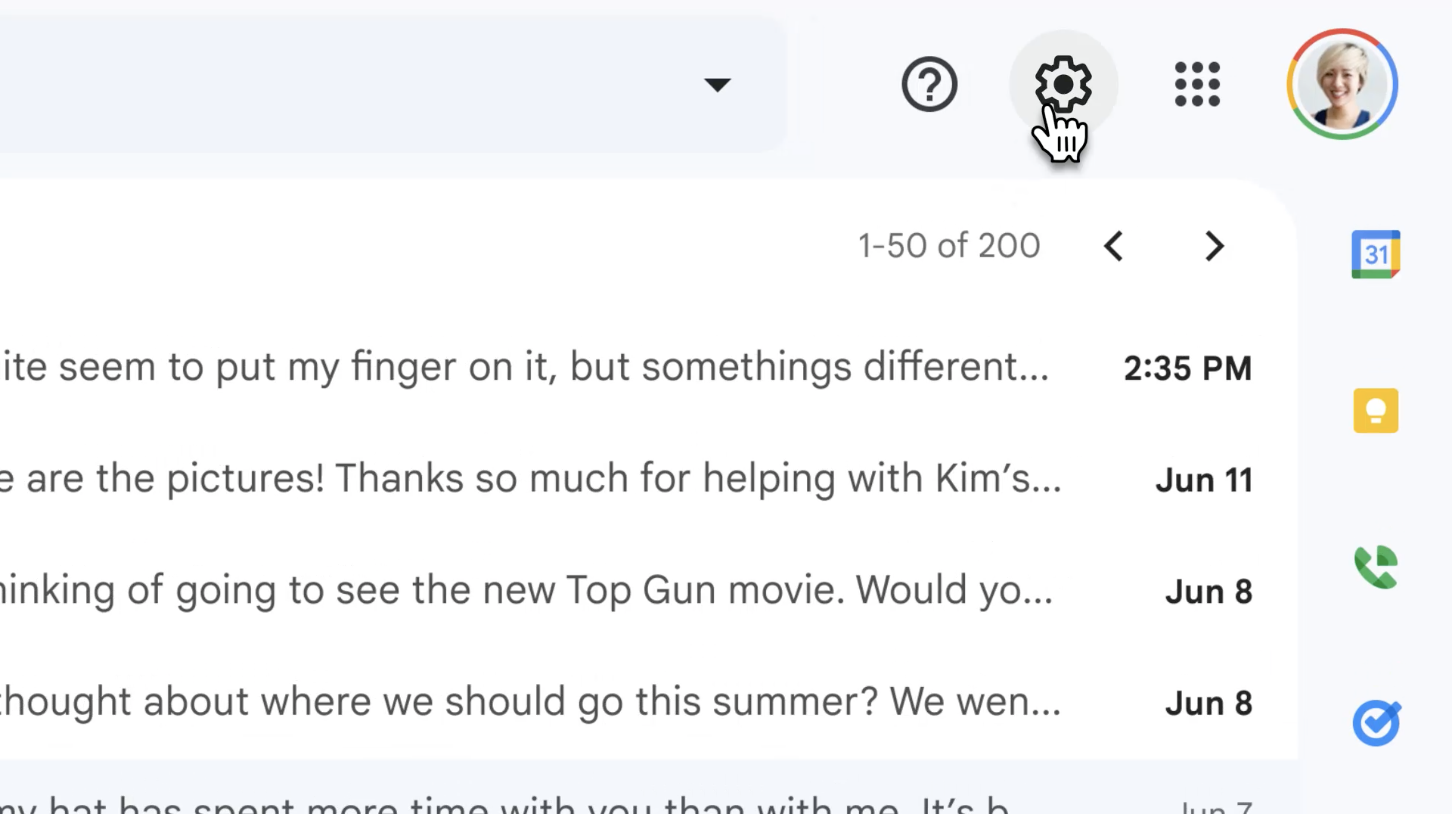
Gmail's total count of e-mails in an inbox
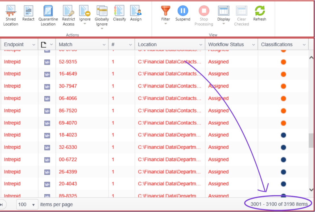
Spirion's (a direct competitor) total count of locations with matches
Users lost track of where they were in nested hierarchies
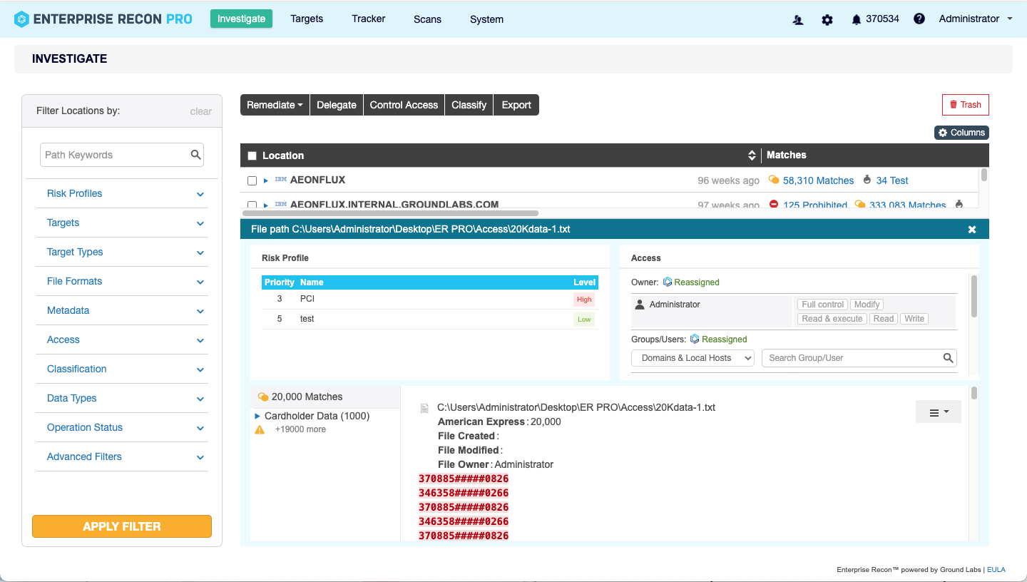
The current data table lets users get lost in a sea of locations, without any feedback about which higher level group they are looking at. Users can only find out by manually scrolling all the way up.
One of our user's pain points were that they often lost track of the overall platform that they were investigating. This is due to the nested hierarchies of platforms, folders and files. Once a high level platform is expanded, users scroll so deep into it, literally losing sight of the high level row. Although we weren't able to solve this issue with this redesign, here are some ways I explored to display nested hierarchies in a data table.
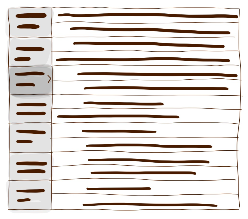
In this solution, all top level parent folders will be displayed on the left as a separate column. When a parent folder is clicked, the right side will show all the locations in that folder.
- ✅ Visually draws attention to the parent groups, giving users a high-level overview of the data
- ❌ Takes up extra vertical space, which could be used to display more columns in the data table
- ❌ Only the contents of one parent folder can be viewed at a time — cross investigating is not possible
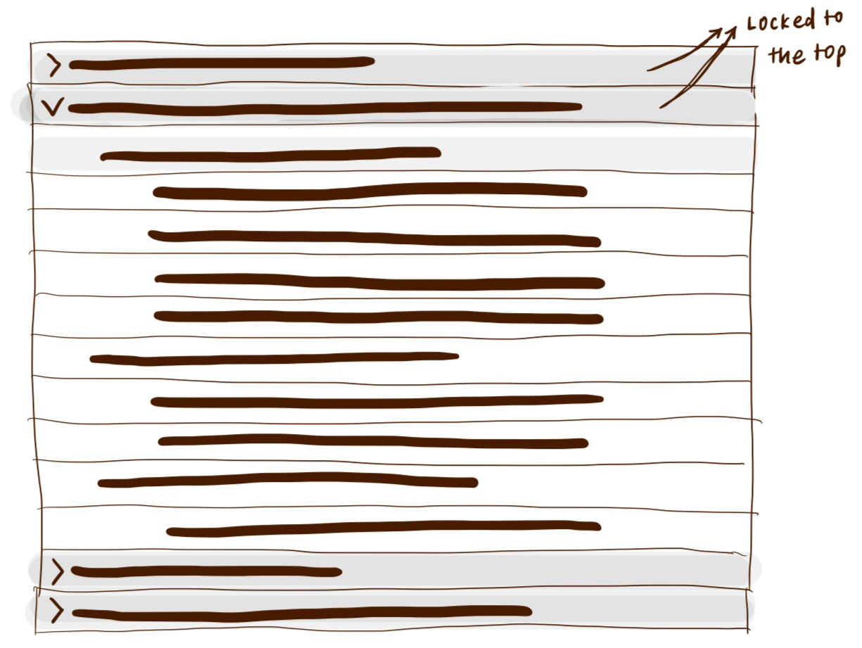
In this solution, the top level parent folder in which the user is currently scrolling through will always be locked to the top. As the user scrolls into the next parent group, the locked row will change to show this next parent group row.
- ✅ Simple and straight forward solution without too much change to the UI. Least amount of transition for users.
- ❌ Extremely complex and high cost of engineering due to some legacy frameworks used in the backend
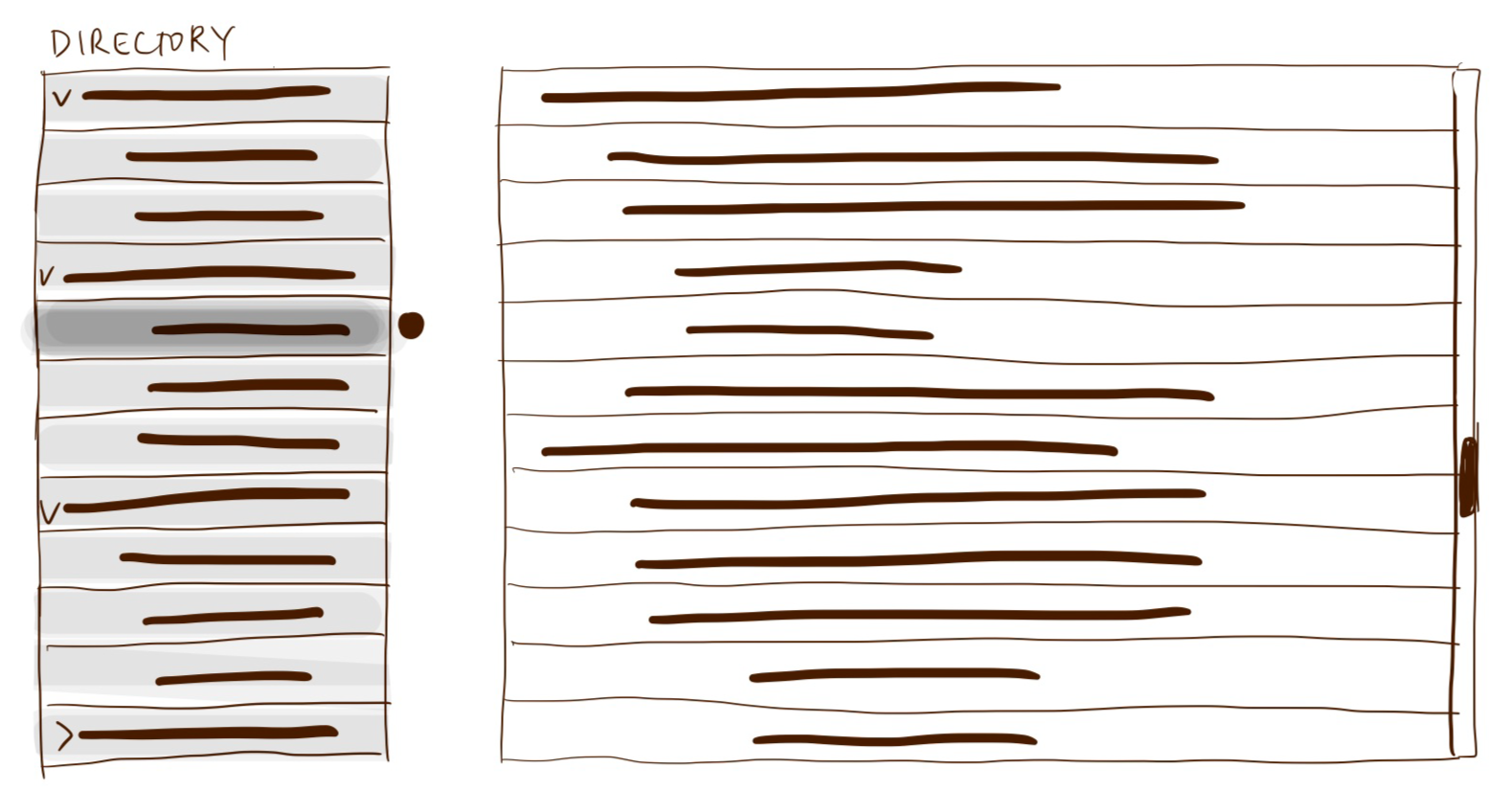
This solution offers a separate directory that would help users navigate the main table. Users can jump from parent group to parent group quickly without much scrolling. The directory will also serve as a "You are here" indicator, so that users always know which group they are looking at.
- ✅ Offers more than 1 benefit — both as a "You are here" indicator and navigation help
- ✅ The directory could be a space where quick data summary is shown
- ❌ Complex both in terms of UX and Engineering work
- ❌ Adds quite a heavy UI element to an already overwhelming page
In the end, we had to take this improvement out of the scope of this redesign to meet release deadlines. However the research remains valuable, for when this project is picked up again.
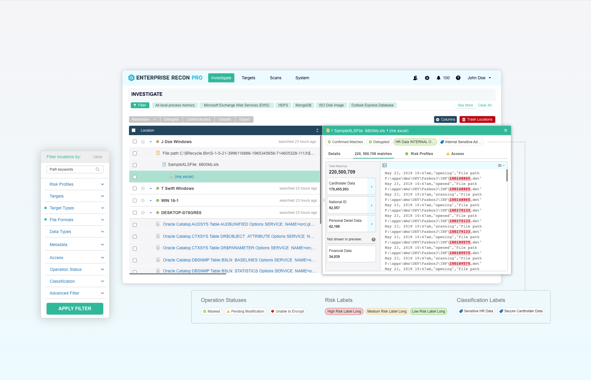
The Launched Redesign
Along with the improvements to functionality, I also simultaneously worked on a new design system and improved style guide for Enterprise Recon as a whole. As such, the new design shown here also has a new style as compared to the old design.
Improved Resizable Preview Window
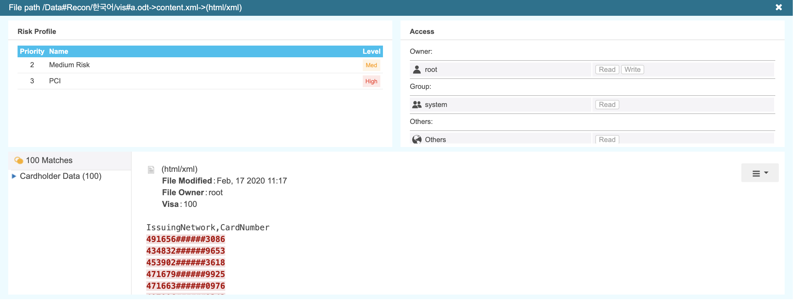
The new preview window opens as a side panel and can be resized to be much larger. The filter panel can also now be hidden to make more space for the data table as a whole.
Organized in Tabs
The new preview window now presents information in tabs, so that each section is more readable, especially the match preview section. The information is also more organized and scalable for future additional sections we would want to include.
Highlight Tags
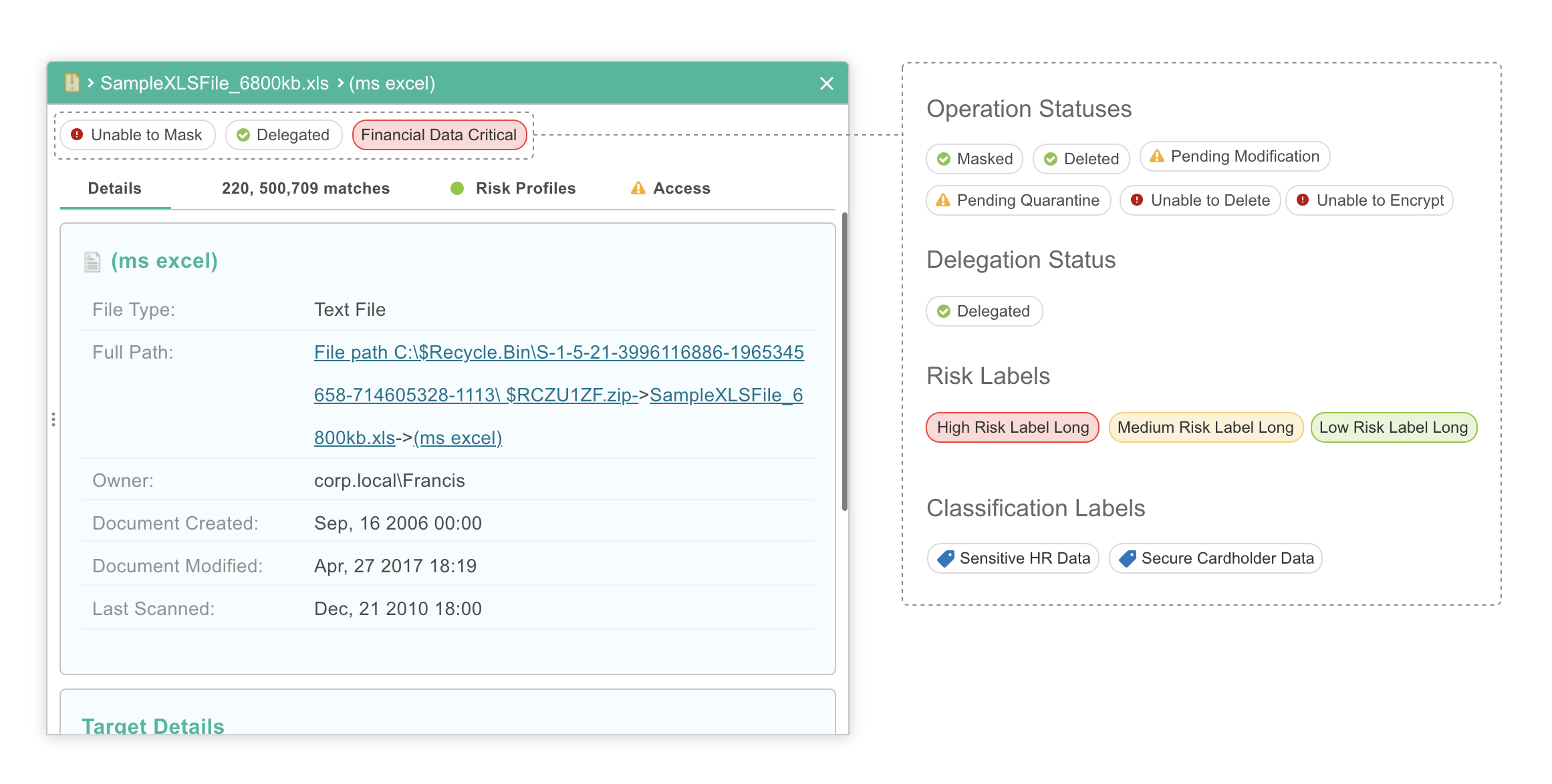
I recognised that including tabs in the design may cause users to need to keep switching between them to get important information on a single location. As such, I gathered feedback on the top 4 data points that users are looking to know to quickly make actionable decisions. We designed a top panel to house these 4 points as highlight tags, easily accessible no matter what tab the user is on.
What I learned from this project
Usability testing with mock-ups isn't always enough.
I struggled with usability testing with this feature because it's so data heavy. Many of the issues only started to surface once a working build was available with realistic data for specific scenarios to be tested. With features like this, it would be important to add some time into the design process to do testing after key functionalities have been built.
Crystal clear requirements.
When passing on the requirements for the feature design over to the devs, it is important to be as clear as possible. Especially with big features like this, it was very helpful to have multiple meetings where product and engineering went through each requirement to clear up confusion and to make the requirements more robust in clarity.