BookingSG started with appointments, a platform for government agencies to manage services like consultations and in-person activities. As the product matured, the team considered whether the same interface could handle facility bookings too: meeting rooms, event spaces, shared equipment. The answer was no, and that decision became the foundation for something more considered.
I worked across the facilities workstream, covering the end-to-end booking experience design, a UX audit and usability testing with GovTech's internal power users before the platform went into development.
Facilities and appointments are fundamentally different booking behaviours
When you book an appointment, you pick a service first, then find a time. When you book a room, you already know what you need: you're scanning for availability, choosing based on what's free. These aren't variations of the same task. They're different mental models that need different interfaces.
We made the call to build facilities as a separate interface, selectable when an agency sets up their platform, so each could be designed for how people actually use it. That call shaped everything that came after.
Rather than retrofitting the appointments interface to handle facilities, we built the facilities experience from the ground up, optimised for availability-first browsing, not service selection.
Designing for how people book rooms
With the decision to build a separate facilities interface made, the design work started from a simple question: what does the mental model actually look like when someone books a room? The answer shaped every layout decision that followed.
A calendar-first layout
In appointments, the service comes first. You choose what you need, then find a time that works. Facilities reverse that order entirely. By the time someone opens the booking page, they already know they need a room — what they're trying to figure out is what's available and when.
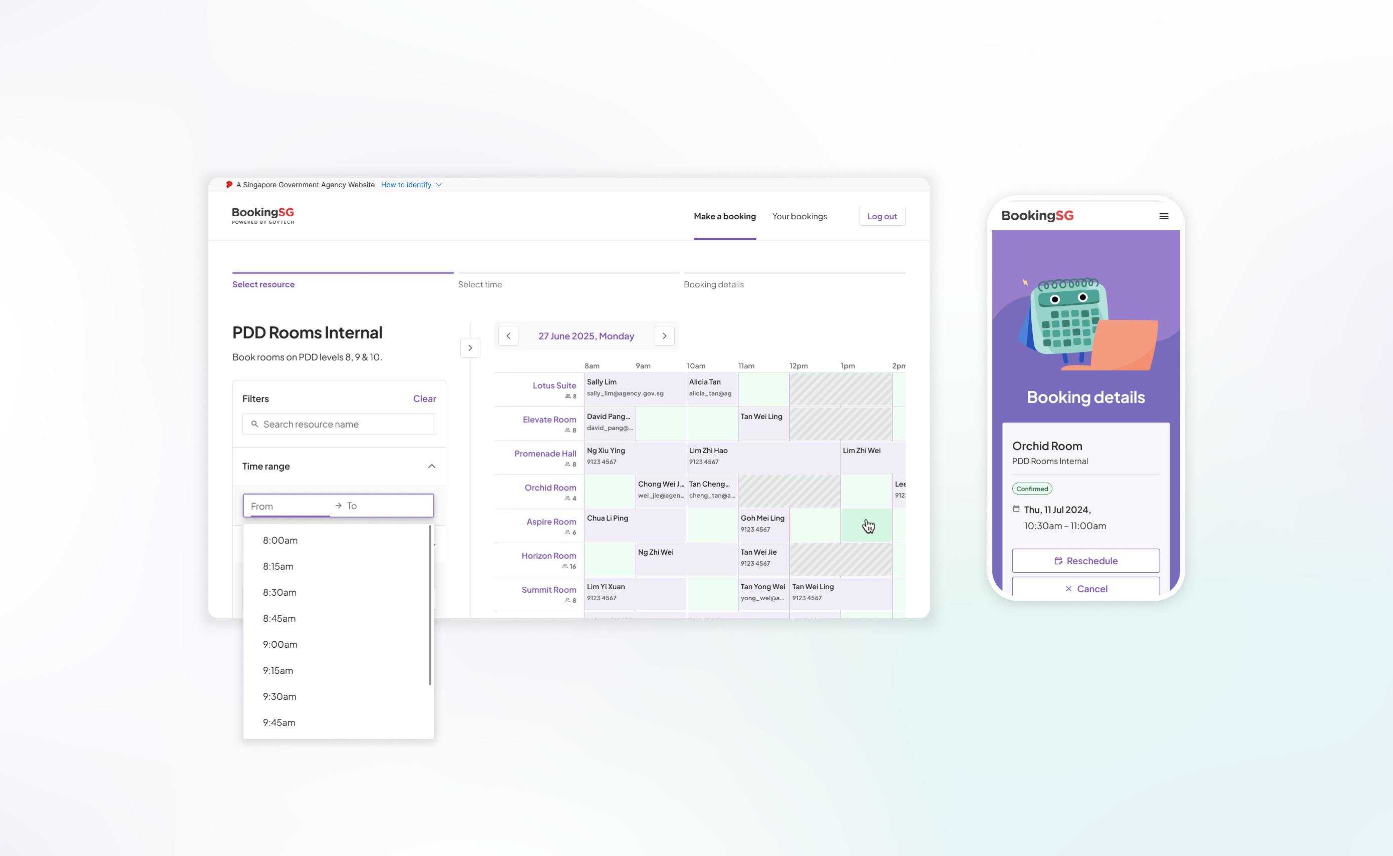
The browsing page was redesigned around that behaviour. Rather than presenting rooms as a list to scroll through, the layout puts a timetable grid front and centre, showing availability across all rooms at once. Users can orient by time first, scanning across the week to find an open slot, rather than opening each room individually to check its calendar. It's a small structural change that cuts out a significant amount of back-and-forth.
The facilities browsing page, organised around a timetable grid rather than a room list — availability across all rooms visible at once.
Time range selection, not fixed slots
The appointments interface used discrete, pre-defined time slots — you pick a slot, and the duration is fixed. That works for service-based bookings where the appointment length is set by the agency. Room bookings are more flexible. Someone booking a meeting room for a workshop might need two hours; someone booking for a quick catch-up might need thirty minutes.
We introduced a time range selector where users pick a start and end time directly, rather than choosing from a list of slots. Admins can configure minimum and maximum durations per resource to maintain control, but from the user's side the experience feels open and intuitive. You decide how long you need the room; the system tells you if that window is available.
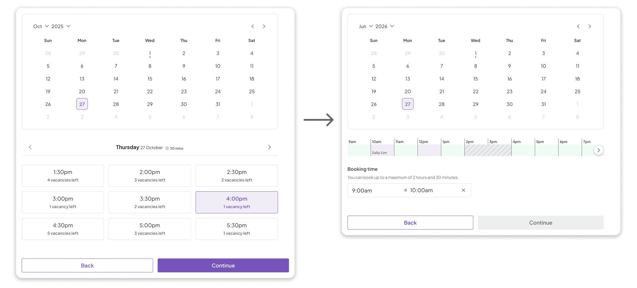
Left: the appointments flow, where time slots are fixed and pre-defined. Right: the facilities flow, where users pick a start and end time freely within admin-configured limits.
Capacity as a first-class data point
One of the first things someone considers when choosing a room is whether it fits their group. Capacity was previously buried in individual room detail pages. We brought it onto the room cards in the browsing view itself, alongside other deciding factors like floor level and available equipment. The goal was to let users rule rooms in or out without having to open them, reducing the number of clicks it takes to find the right fit.
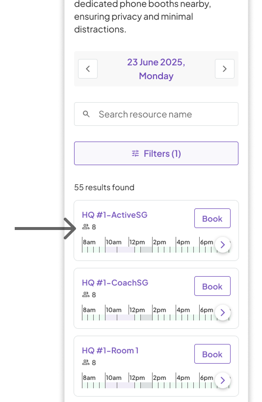
Capacity surfaced directly on room cards in the browsing view, alongside the mini availability timetable.
A Your Bookings page built for repeat users
The appointments side of BookingSG didn't have a strong need for booking management. Appointments tended to be one-off, and users didn't need a place to track multiple at once. Facilities are different. PAs book rooms repeatedly, often across different dates and rooms simultaneously, and they need to reschedule and track actively.
We introduced a dedicated Your Bookings homepage as the starting point for returning users, shifting from a card-based layout to a denser table design with filters and a calendar strip showing which dates had bookings. The goal was to give power users the overview they needed at a glance, without having to dig through individual confirmations.
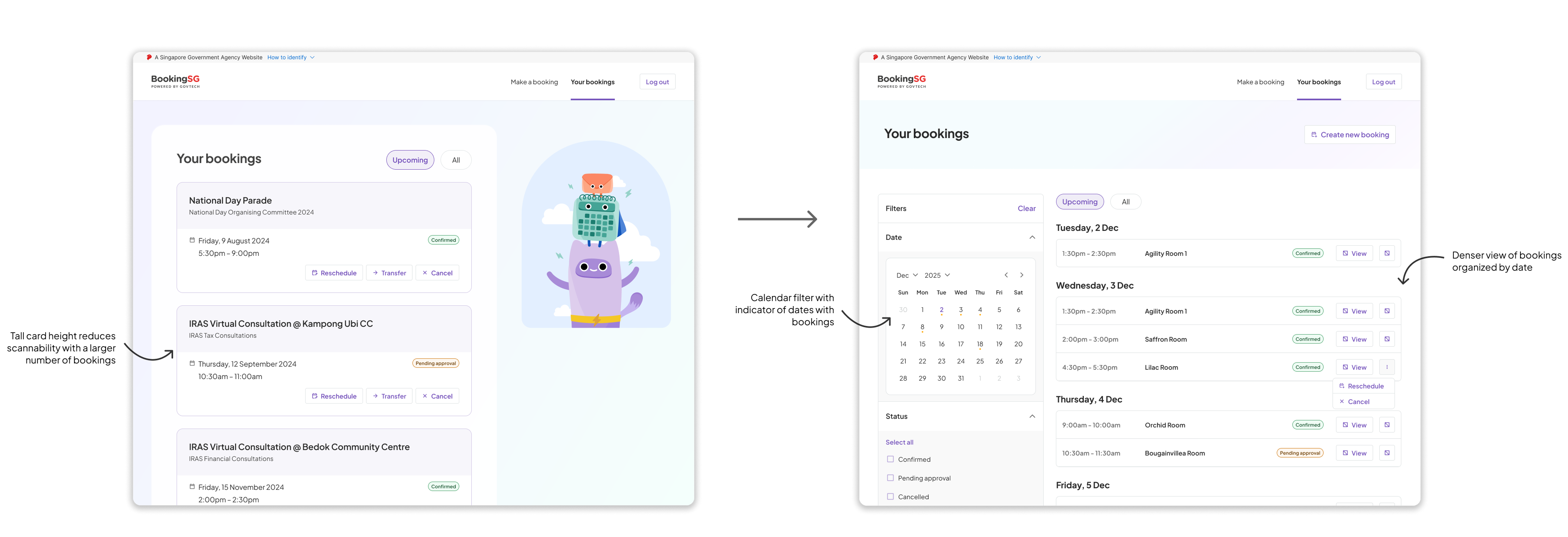
Left: the existing card-based layout, where tall cards reduce scannability across many bookings. Right: the redesigned facilities version — date-grouped rows, status filters, and a calendar showing booking density at a glance.
Usability fixes from the audit
Alongside the new features, I ran a UX audit of the existing flow and flagged several issues I pitched for fixing before the platform shipped.
The calendar and time selector dropdowns defaulted to 12am as the first available time. No one books a government room at midnight. Starting at 8am is a small detail, but it removes a moment of confusion and signals that the interface was designed for how people actually work.
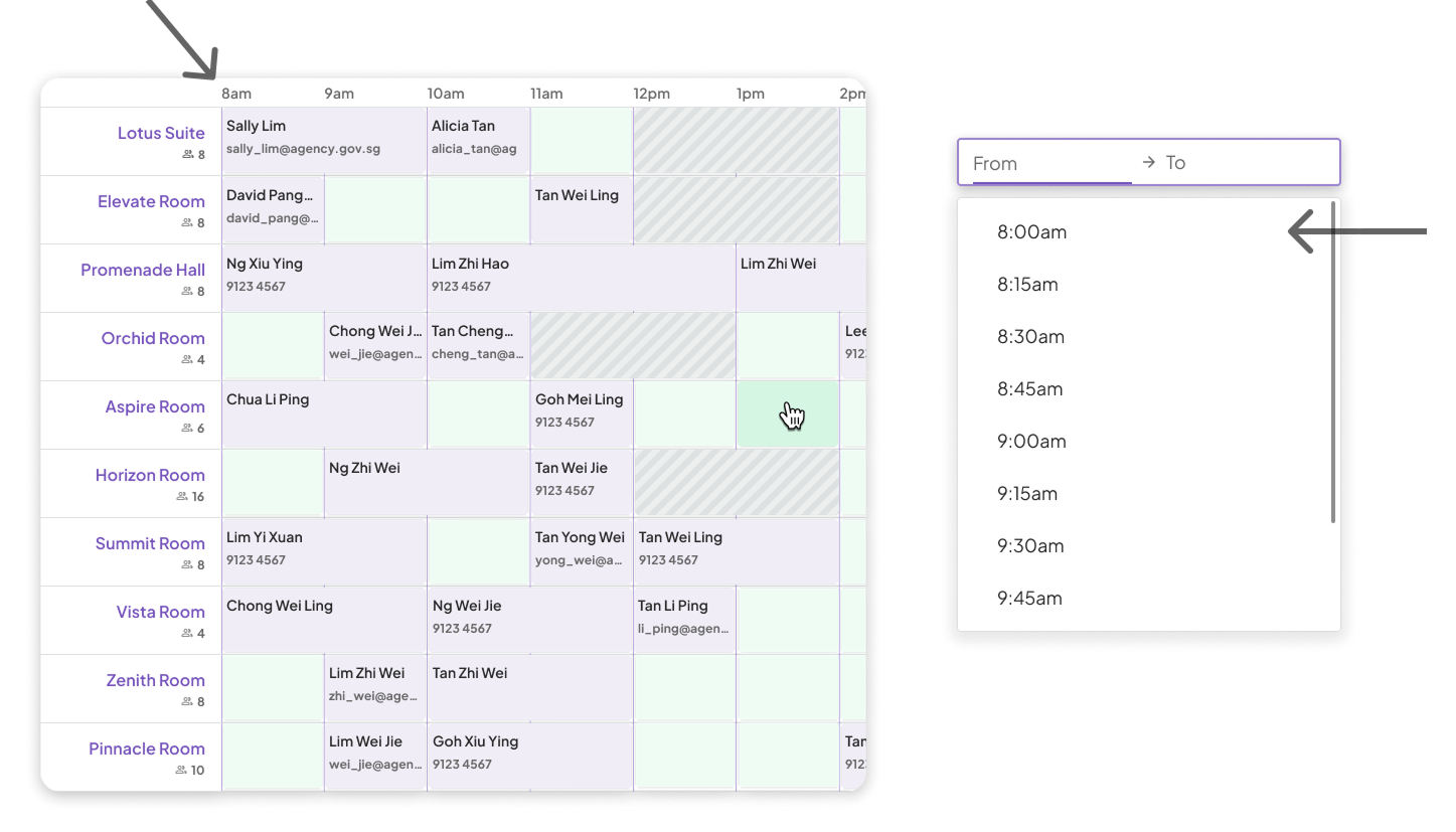
Both the main timetable and the time range dropdown now start at 8am, reflecting when rooms are actually available.
The browser back button took users all the way back to the dashboard instead of the previous step in the booking flow. This matters more for facilities than appointments because users often compare multiple rooms before committing — checking one room's details, going back to look at another, then returning. Breaking that navigation loop adds unnecessary friction and increases the chance of users losing their place entirely.
The third fix was about rescheduling. When a user rescheduled a booking, they were taken to a time selection page with no way to check availability across other dates without navigating away. We brought the daybar — a mini strip showing that day's availability — into the time selection step itself, so users could scan for a new slot without having to leave the page and lose their context.
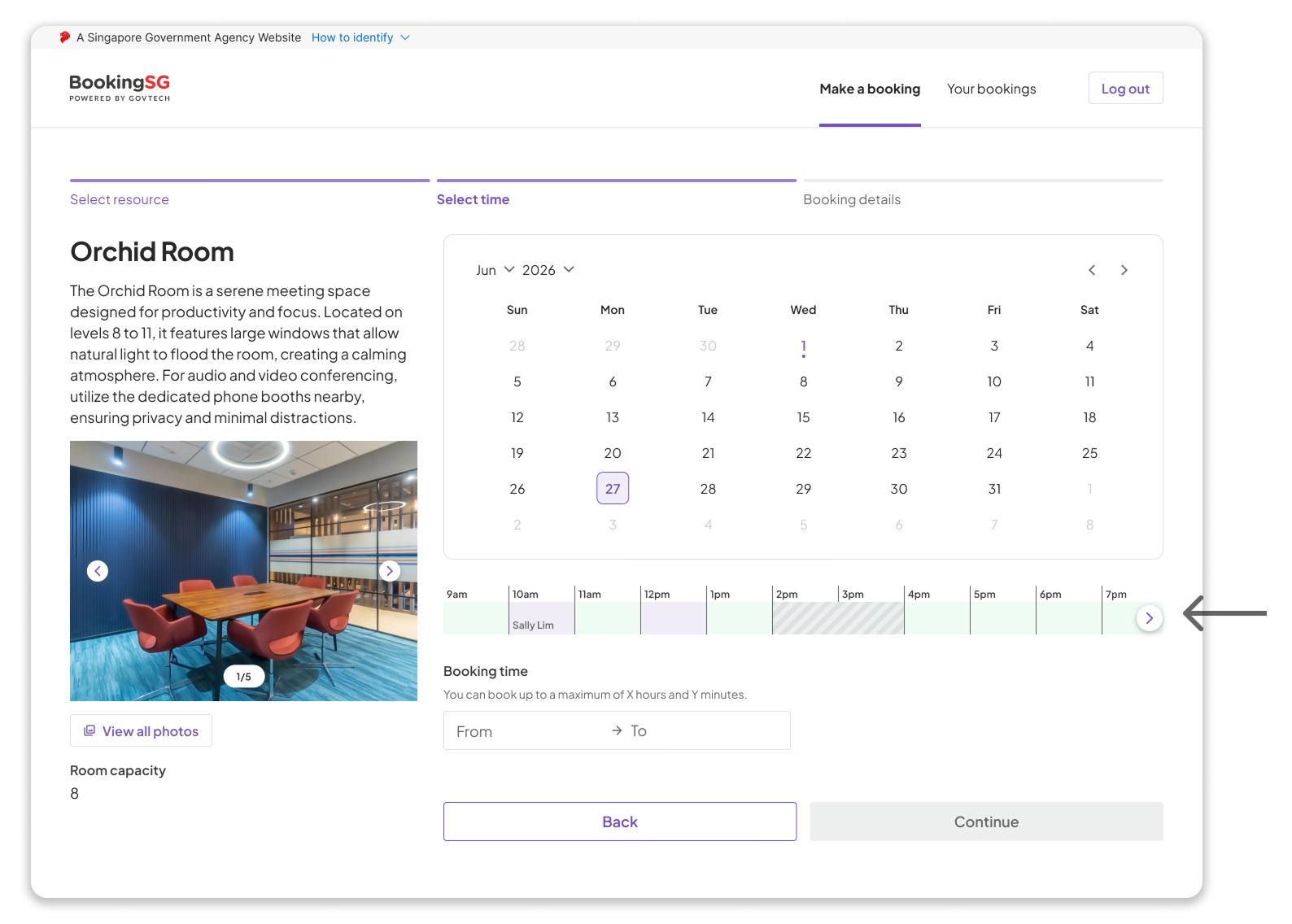
The daybar embedded in the time selection step, showing that day's availability without requiring users to leave the page.
Testing it with real users before it shipped
Before any of this went into development, I initiated a usability test and built a prototype using Figma Make, with the new Your Bookings design included. The UT had a dual purpose: validate the design, and answer a bigger strategic question: could BookingSG's facilities platform replace GovTech's existing internal room booking system, Workpal?
To answer that, we needed to test with the right people. GovTech Personal Assistants are power users of the current system. They book rooms daily, often for multiple senior stakeholders, and they know exactly what a good booking experience needs to do. Seven PAs participated in moderated in-person sessions across two weeks in January 2026.
- Complex Scheduling: Manage calendars for multiple stakeholders.
- Frequent Access: Daily interaction with the booking platform.
- Specific Needs: Focus on large-capacity rooms (8–12 pax).
- Device Preference: Desktop
Strongly positive results, with three clear directions
Beyond the scores, the sessions surfaced three specific findings that shaped our recommendations.
Users wanted richer room information at the point of booking
PAs booking for executives hosting external guests needed to know capacity, exact location (east/west wing), equipment specifics, and multiple photos before committing. We recommended enriching the resource detail shown on the booking page and ensuring photos included multiple angles and a floorplan.
Users preferred scanning all rooms over filtering
With a limited pool of available rooms, filtering felt like it would reduce options rather than help narrow them. Users wanted to see everything at once, sorted by level, with the timetable expanded. We recommended a labelled "Wide view" toggle and a hover popover with key room details, so users could compare without leaving the browsing page.
Users avoided rescheduling, not because the flow was broken, but because they feared losing their slot
The reschedule task scored a high SEQ of 6.4, meaning the flow itself was smooth. But all 7 participants said they would rather book a new room and cancel the old one manually, in case the new slot was taken before they secured it. This was a behavioural insight that no one had documented before, and it pointed to a broader scarcity problem beyond what the interface could solve alone.
Recommendations
The findings shaped two concrete design recommendations we brought back to the team.
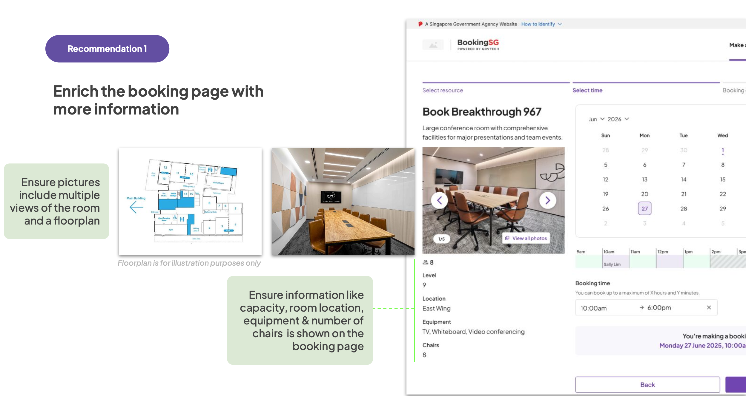
Ensure photos include multiple angles and a floorplan, and that capacity, location, equipment, and chair count are all visible on the booking page.
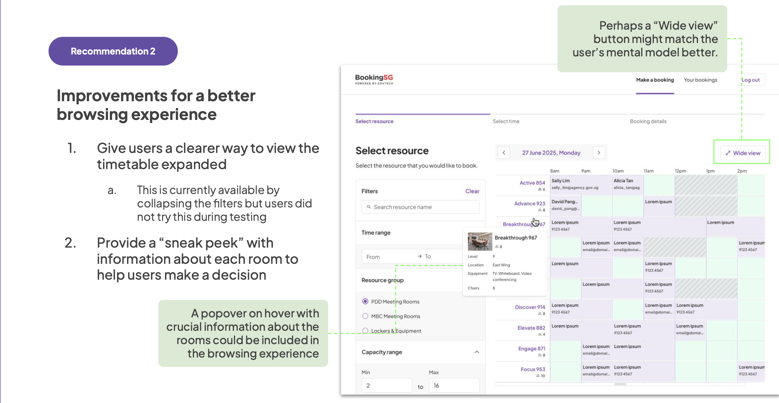
A labelled "Wide view" toggle to expand the timetable, and a hover popover surfacing key room details — so users can compare without leaving the browsing page.
Systemic frustrations beyond the interface
The UT also surfaced frustrations with how room booking works at GovTech more broadly: soft bookings holding rooms speculatively, manual swap negotiations between PAs, and the stress of having to actively "start" a booking on time or lose it. These weren't interface problems. But naming them clearly in the research report was part of the job.
What I learned from this project
Behaviour, not features, should drive product architecture decisions.
The decision to build facilities as a separate interface rather than extending appointments wasn't about complexity. It was about mental models. Appointments and facilities are different enough in how people think about them that a shared interface would have compromised both. Getting that decision right early made everything downstream more coherent.
Strategic questions need strategic testing participants.
Testing with GovTech PAs rather than general users wasn't just about recruiting convenience. These were the people whose existing habits the platform needed to match or exceed. Their familiarity with the status quo is exactly what made their feedback credible evidence for a high-stakes product decision.
Behavioural workarounds reveal systemic problems the interface can't fix alone.
Every one of the seven participants said they'd rather book a new slot and cancel the old one than use the reschedule flow, even though the flow itself was fine. That's not a UX problem. It's a scarcity problem. Capturing that distinction in the research report mattered, because it pointed product and policy toward where the real intervention needed to happen.
Naming systemic problems clearly is part of the job.
The soft bookings, manual negotiations, and timing pressure PAs described weren't things the design could address. But surfacing them clearly gave the team a more honest picture of what they were inheriting, and what the platform would need to eventually account for if it was going to be a genuine replacement for the existing system.
BookingSG is set to roll out as GovTech's internal room booking system in October 2026. The confidence to make that call came from somewhere, and the work we put into the facilities platform, from the product decisions that shaped it to the research that validated it, was a meaningful part of building that case.